Join devRant
Do all the things like
++ or -- rants, post your own rants, comment on others' rants and build your customized dev avatar
Sign Up
Pipeless API

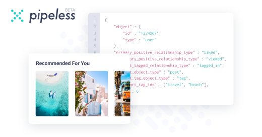
From the creators of devRant, Pipeless lets you power real-time personalized recommendations and activity feeds using a simple API
Learn More
Related Rants

 The aCalendar app let's you choose vibration pattern, it's one of the better settings I've seen.
 When you take User Experience to the next level. Just what I was thinking
Credits : Riot App
 Been looking around ways to improve devrant's user experience a little, Idk whether you guys like it or not.. ...
Based on what I learned so far in the UX course, the UX textbook we learn from is utter shit. Who the fuck thought that using huge blocks of cyan color is a good idea?
rant
irony
ux
torture
blind
migraine
bad design
book