Join devRant
Do all the things like
++ or -- rants, post your own rants, comment on others' rants and build your customized dev avatar
Sign Up
Pipeless API

From the creators of devRant, Pipeless lets you power real-time personalized recommendations and activity feeds using a simple API
Learn More
Related Rants

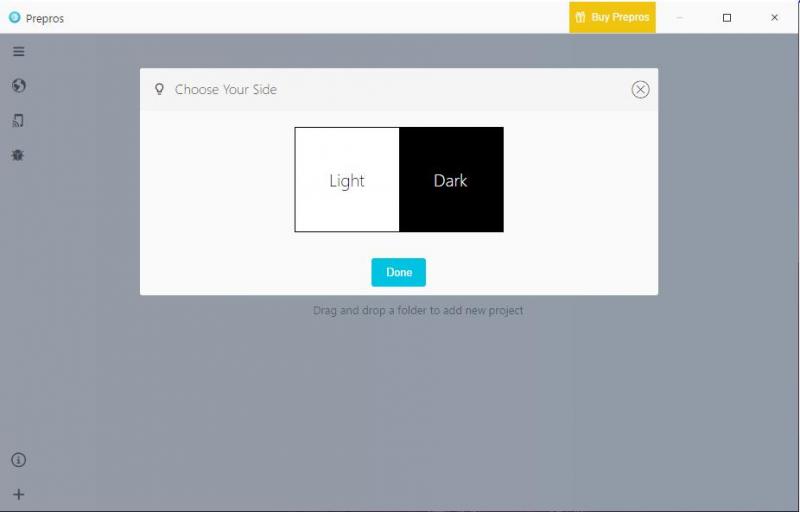
 This is how every app should start...
Dear theme designers, unless you are designing an app specifically with OLED in mind... Do not use black as a main background colour.
It just looks horrible IMO, key example on good dark theme is the windows store and a example of horrible dark theming is the settings app.
And mini rant over.
rant
dark theme