1

text-size-adjust vs viewport meta tag

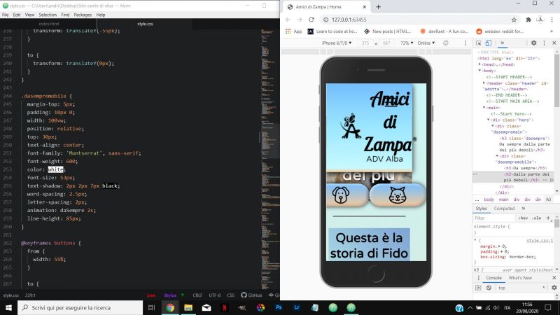
So, I'm designing a mobile-first website with the chrome mobile simulator. I saw that when I put some text in it, for example a <p>, it will display very very small, and will not take into consideration the font size that I gave it, unless the <p> contains several lines of text. I did some research and I figured that this behavior is due to the text inflation algorithm used by mobile browsers and it can be stopped by using text-size-adjust:none. Is that correct? Then, the viewport meta tag. I figured that the viewport meta tag is used when a website it is not designed mobile first, and will help display the content properly based on the smaller width of a mobile devide. Is that correct? In conclusion, text-size-adjust with the value of none is used when building a mobile-first website in order to stop that inflation algorithm and help display the text properly, and the viewport meta tag is used when bulding a NON mobile-first website. Is that correct? Thank you

Comments
  • 0
    I don't think so. You need the viewport to tell the mobile browser that the website is mobile aware. Here's what you should have:

    <meta name="viewport" content="width=device-width,height=device-height,initial-scale=1">

    Otherwise, the browser will instead zoom out and display the website like a zoomed out desktop version. You see the whole site but can't read anything because it's too small.
  • 0
    @Fast-Nop thanks for the answer. So this site that I am designing, I did it without the viewport meta tag, and it looks ok on mobile, but if I try to add it now, everything looks gigantic and crashed into the mobile width. Is that because I should've been using it since the begining and adjust the content sizes according to the "new" layout? Hope you understand what I mean, sorry if it is confusing
  • 0
    @Matthew200 Well if you don't have media breakpoints in your CSS for re-arranging the layout on mobile, then your site isn't mobile ready, and then the viewport tag doesn't help.

    And no, you shouldn't adjust the font size, leave it at 100% (which is what the user has set in his browser) or more. Headings should be a bit larger of course.

    Basically, when you narrow the browser window, your layout should change as it makes sense. That's the number 1 test for mobile reasiness. No dicking around with the font size.
  • 0
    @Fast-Nop got it.
    here an example of the website with the meta added after building it and it looks like this. I don't understand why.
  • 0
    @Matthew200 My guess is that the browser doesn't enlarge the fonts, it just stops zooming out (which it does for desktop-only sites). I also guess that you don't have media breakpoints for adjusting the layout so that things just get squished together. Means, you don't have a mobile ready site. Or does your layout adapt when you narrow the browser window?

    Especially because you have way too much pixel positioning, even the line height is in px. Don't do that, use font relative sizes.

    And I bet that the document language from the <html> tag isn't actually "en", looks more like "it". "ltr" is also superfluous, that's the default.
  • 0
    yes, you guessed it good :).
    For me, it is mobile ready because I designed it with the mobile simulator, but maybe this is a wrong conception I'm having.
    I don't have yet breakpoints because I thought 'let's do it mobile, then tablet, then desktop' and I'm in mobile yet.
    and yes, you're definetly right about the pixels.
Add Comment