
Join devRant
Do all the things like
++ or -- rants, post your own rants, comment on others' rants and build your customized dev avatar
Sign Up
Pipeless API
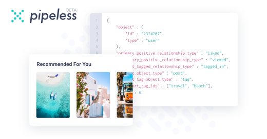
From the creators of devRant, Pipeless lets you power real-time personalized recommendations and activity feeds using a simple API
Learn More


Been thinking about how hard it is to build a clean financial dashboard.
On paper it sounds simple: show prices, charts, account actions, history, and a few risk notices.
In reality, everything competes for attention.
Real-time data wants to update constantly. Account state needs to be accurate. Order actions need clear confirmation. Mobile layout has no space. Error states need to be obvious. And somehow the whole thing still has to feel calm enough for users to trust it.
I’ve been looking at crypto trading platforms as product references, since they put all of these problems in one place.
One example is BYDFi:bydfi(dot)com
Not saying anything about trading itself. I’m more interested in how platforms like this structure market data, navigation, account flows, and risk information in the browser.
Financial UI is one of those areas where “just make it simple” is actually the hardest requirement.
random
webdev frontend ux fintech crypto