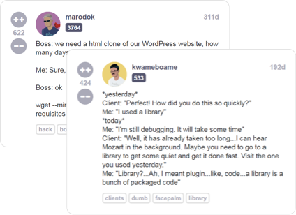
Read developer (mis)adventures from thousands of programmers all over the world sharing their war stories about life behind the keyboard
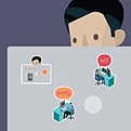
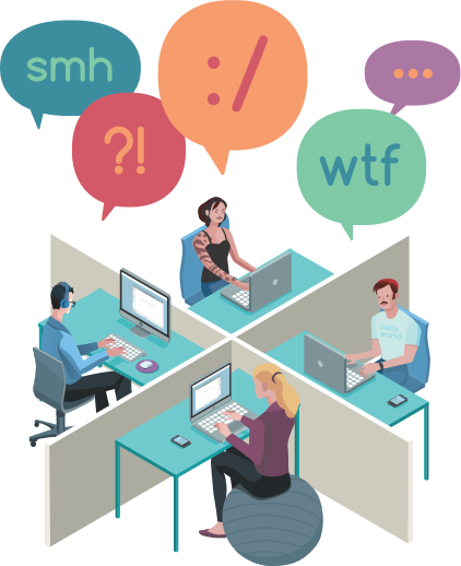
There are a lot of great technical resources for software engineers, but not a lot of places you can go to talk about your life as a programmer with other people who really understand you
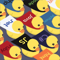
Millions of unique combinations allow you to create your own customized cartoon version of your most badass dev-self
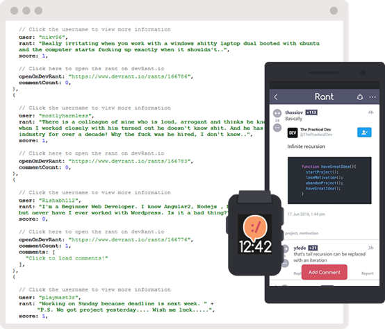
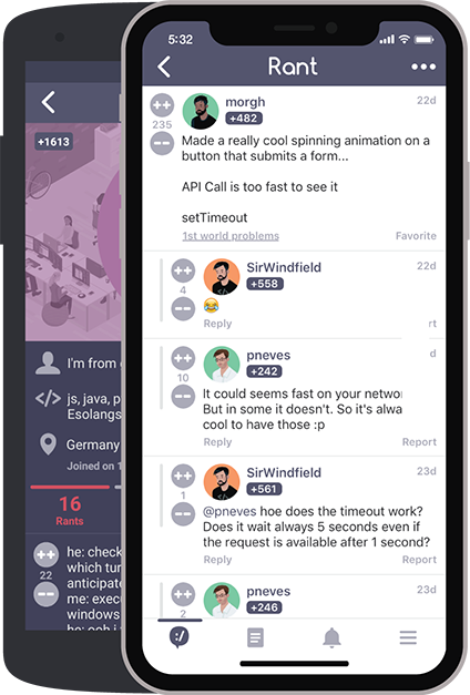
Be an active member of the devRant community by taking part in the lively conversations stimulated by engaging rants