Ranter
Join devRant
Do all the things like
++ or -- rants, post your own rants, comment on others' rants and build your customized dev avatar
Sign Up
Pipeless API

From the creators of devRant, Pipeless lets you power real-time personalized recommendations and activity feeds using a simple API
Learn More
Comments
-
It was VisualStudio in my case - my eyes couldn't adapt to the light / blue theme x_x
-
@dandel10n For me, Sublime was the first...
But, once I got used to it.. I found using Eclipse in their default theme boring...
And, since, I used to code at night, the white background messed with my eyes too much... Hence, dark themes was not only more visually striking, but also the more logical one.. -
Mine was netbeans firts. Always with a white background by default. Than I found out that it had dark theme options. Since then darkness all the way in every IDE and text editor
-
Mine is completely dark .
This is one of the reasons i switched to Linux . I couldn't stand that my sublime on Windows was dark,but in order to keep it 'clean', i had to hide the menu bar (cntrl+shift+P: toggle menu) because that hideous thing was forced to be white. Once i switched to Arch my beautiful sublime looked better than ever. -
You know, the thing which interested me the most, when Windows 10 came out was the taskbar and the start menu was following the dark theme...
In fact, I was using Ubuntu and the first things that I did was to add darkness to my theme as well as converted to icon theme to Numix Circle...
The thing which appealed to me the most was the richness of the colour pallette that is being used with Dark themes...
This was especially highlighted in Sublime... As well as IntelliJ IDEs..
And, I didn't like how white backgrounds literally blinds me, especially in dark or low light conditions... I find it distracting... -
 SHA-25614369y#WhiteUiMustDie
Mostly because it hurts the eyes in the dark and because my phone has an AMOLED display... -
@aquacash5 Dracula is IntelliJs take on Sublime's Monokai...
Got acquainted with the Dracula, when I started using Android Studio..
And, frankly speaking, both Dracula and Monokai are too good and I can't choose between the two... -
I use Monokai in Sublime, Atom, Netbeans, Android Studio. Pinkish red and blue text colour on black background is so soothing 😀
-
@saifat29 Definitely agreed...
While I don't have issues with Dracula and I am okay with it.. And, by 'okay', I mean that I will not change it to Monokai..
Even though, I like Monokai better.. For me, Monokai was my first love and hence, will always hold a special place in my heart...
Sorry for becoming a little bit poetic.. But, what can I say, Monokai just makes my heart sings...
Damn you, Lord Byron.. (Was reading 'She Walks In Beauty, about half an hour ago... Blame him, not me..) -
@saifat29 Little bit more colourful and a little bit more vibrant...
But, frankly, I love the DevRant's dark theme.. And, I wouldn't change it in the world, not even for 'Monokai'... -
In my opinion there is only one real dark side, it's solarized dark. Using this for every IDE, tool or shell.
-
@cattoaster Never really tried Solarized Dark... But, good to know that we are on the same side: the Dark Side...
-
 zinnoa1599ySublime was my first serious text editor, so I've kind of been on the dark side from the start.
Related Rants


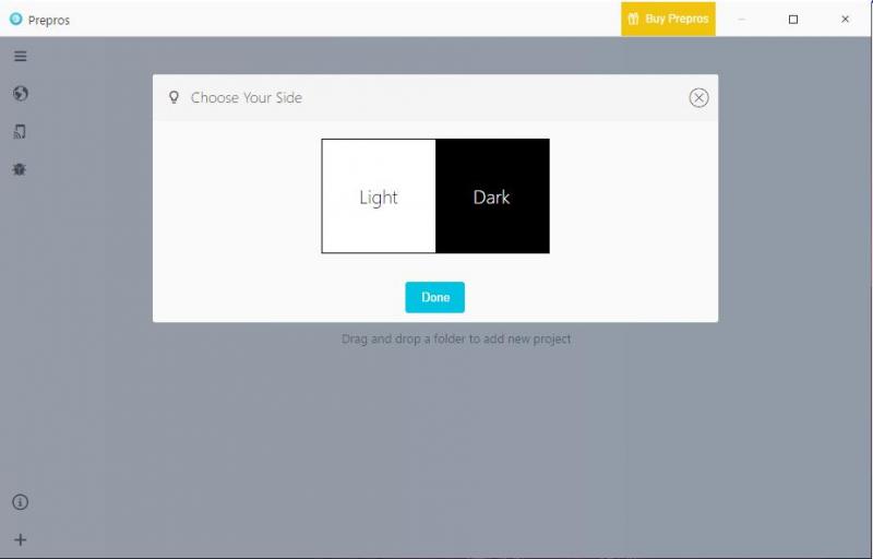
 This is how every app should start...
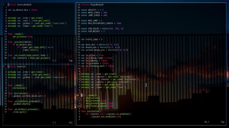
How many converted to the Dark Side after working Sublime??
And, now, whenever we encounter the Light Side, we initially search the settings to turn it to Dark...
undefined
dark theme
monokai
sublime