Ranter
Join devRant
Do all the things like
++ or -- rants, post your own rants, comment on others' rants and build your customized dev avatar
Sign Up
Pipeless API

From the creators of devRant, Pipeless lets you power real-time personalized recommendations and activity feeds using a simple API
Learn More
Comments
-
@BambuSource light looks better. The button is too bright altough it does not mean it looks bad or anything. It looks nice and professional man :)
-
both are nice, light is better because the dark one has two dark things above each other, by that I mean the area where the user needs to focus is also dark with two white fields (aka bright) makes it harmful to look at IMO
For light just use a light color but not a bright one because your main background is not bright dark (if that even counts lol)
Related Rants
-
 devmonster84
 My friend said an intern designed this UI for an internal site.
No. Just... no
 -
 FTcuber30
 When you're not creative enough to make a post that would give you some stickers but you have a 3D printer...
 -
 htlr79
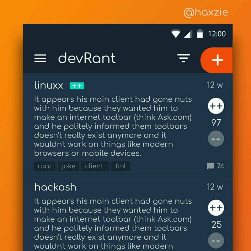
 Been looking around ways to improve devrant's user experience a little, Idk whether you guys like it or not.. ...


Hmm, too much?
question
logo
client portal
design
personal site