
Ranter
Join devRant
Do all the things like
++ or -- rants, post your own rants, comment on others' rants and build your customized dev avatar
Sign Up
Pipeless API

From the creators of devRant, Pipeless lets you power real-time personalized recommendations and activity feeds using a simple API
Learn More
Comments
-
 Buggz6047yI like it, but I feel that the right section is just a tiny bit too cluttered. I think making the 12w slightly more subtle will be enough. Give the ++ and -- a bit more breathing space.
Other than that, A+! -
 Axios1517yThis looks very good. The thing that I would like to see a bit more is spacing up and down on the rant content.
Otherwise, very cool :) -
 htlr51057y@rEaL-jAsE just some random design 😅 If I can get the api, I'd be happy to build a client.
 -
@htlr The public devrant api is available by contacting info@devrant.io
Or you can visit https://devrant-docs github.io for online unofficial public api docs.
@ewpratten @AlpineLinnix According to David, he said that apps using the devrant api in any way should not be uploaded to Google Play and Apple App Store.
You may contact him by discussing whether it is okay to just release the source in github. It is up to him. -
Scrolling rants today ive tought about "why theres no username near a rant" and now i got it, fast
-
Looks great but that + button needs to stay in its place, much easier to add a rant or a comment when the button is down there
-
This is what we need! Sexy material UI. Please include dark mode so we can keep ranting even at night xD
-
@htlr it does tbh, but a simple scroll will do it, but I think it is in the best place
-
Looks awesome! Like someone said, give more breathing space to the elements in the right. And I think the new rant button should stay on the bottom (it's easier to reach). This is the slickest app design I've seen in a while. Great job!
-
@theKarlisK to each his own, though the new update better include both so that no one misses the button or gets irritated by it :P
-
 shaki3517yit's just design, I personally don't care how it looks as long as it's easy to navigate.
Now one thing to suggest is opening the comments from the main page without having to go into the rant itself, like a long tap on the rant that'll open a small window where you can swipe up and down to read the comments.
in other ways, making browsing and reading rants a bit faster imo -
Looks amazing. If I could drop in my two cents, I would say it's better to hide the username on rants like how it is now. It works out well in the feed that way coz it's a non distracting unbiased steady flow of rants. Also, like someone suggested as a game idea, it is always fun to guess which ones are @AlexDeLarge's rants from the feed.
-
 kLue2057yregarding author on rant i like sort of anonymity atm.
anyway new look feels nice and more right hand ppl friendly ;) -
@Jilano slowly add things until rebuilding is needed to stay usable.
This UI is clean, everything is at max 4 clicks away. There is litterally no need to change something when there are UX wise no problems with it. -
@ewpratten I emailed them because I am working on one. It is disallowed because they currently already support android and people may steal credentials.
-
htlr51057y@Codex404 4 clicks are too much 😶 especially I didn like how the add rant button stayed at the center blocking the view.
People usually tend to read from left, so moved the ++ and - - to the right that'll be easier to reach (can add an option to reverse the position for lefties)
The navigation bar puts everything in right place including the profile and settings which is currently, idk maybe like alienated. -
 dfox421567yLooks cool! We’ll definitely see if there’s any elements we can incorporate and we appreciate the feedback in this thread on various individuals elements. There’s certain elements that go against UX guidelines we’ve established and gotten feedback on, like usernames on the feed, so while some things look good, they don’t always make sense from a UX perspective.
Also, to touch on something that a few people have mentioned and we do want to make sure is clear, we do not allow any apps using the devRant API to be published in the Google Play Store or iOS App Store. We consider it a major security risk (possibility of stealing login credentials fairly easily) and we also would be concerned with confusion since searches for devRant drive many of the downloads to the app.
Until we have an oauth-based login system, we encourage non-credentialed use of the API to prevent security issues. -
dfox421567y@xzvf it’s fine to do something for personal use, but any public/distributed binary download or build is forbidden.
-
 BadFox23017yLooking good. I with that was what devRant looked like. It could even be implemented as an additional microtransaction and I'd buy it.
 -
If it were me, I'd change the body text to something else more 'open sans', I don't think that font is good for big paragraphs, only really for headings
Other than that, I'd love to see the switch to your design!👏
++ -
 Condor315487yThis looks amazing!
@dfox is it permitted to make open source clients that authenticate against the API and publish source code to GitHub/GitLab, while pushing a build to e.g. F-Droid? I've been wanting to make a client for tablets for a while now, since I prefer working in landscape on it (which the devRant app doesn't support), and the web app doesn't really cut it for me. Don't get me wrong, I appreciate the efforts put into it but I tend to prefer native apps for the stuff that I use often. -
Condor315487y@AlpineLinnix but I'm running Android Nougat on it 🤔
Btw it doesn't render very well on tablets to begin with.. the app doesn't seem to cope very well with the plentiful screen real estate - it's clearly designed for phones.
Attached is a screenshot of it.. it really doesn't use the available screen real estate to its fullest, so I doubt that I'd want to work around all that. Personally I'd go with the tabbed (edit: split-screen, rants on the left, comments on the right) UI like what's present in devRantron and devRant UWP instead, optimized for touch and material design, and much less pop-up stuff than devRantron.
-
Condor315487y@AlpineLinnix well.. it works, but the devRant app doesn't seem to like this orientation fuckery at all 😅
Nice Android hack though, could prove itself very useful in other apps 😁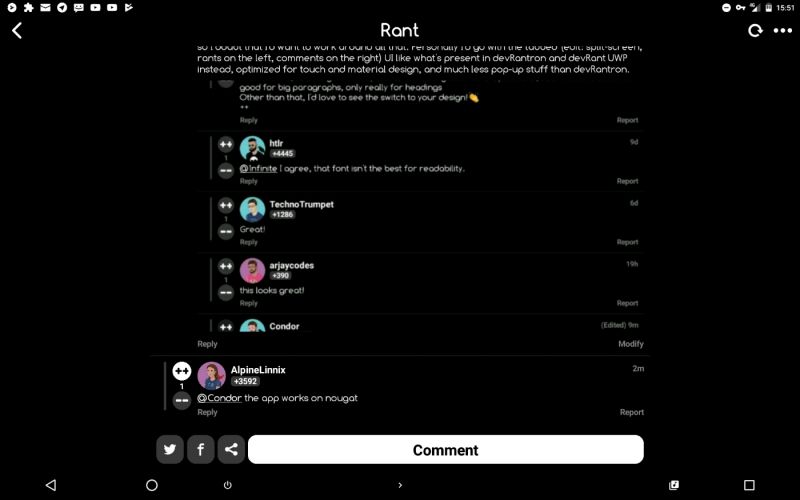
-
@Oel2 I agree, I'm left handed and having them on the left makes it easier for me, but I can understand some may want the opposite. Allowing the user to choose improves UX exponentially. 😁
-
 Loading9387ydevRant 2.0!
For all of us developers than have OCD this is makes it less a bundle of words and makes them look like real rants -
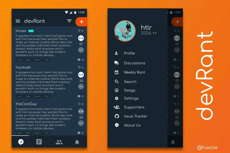
 adempus2687yThe first one sorta reminds me of Reddit's layout a lil bit. But the designs are really nice. What'd you use?


Related Rants
-
 Skipp35What devrant taught me: Everyone hates java Everyone hates php Everyone hates spaces Everyone hates tabs Ever...
 -
 devmonster84
 My friend said an intern designed this UI for an internal site.
No. Just... no
My friend said an intern designed this UI for an internal site.
No. Just... no -
tommy16Right now someone at Google is coding something useless for us to laugh at on April Fools.
Been looking around ways to improve devrant's user experience a little, Idk whether you guys like it or not.. Just a suggestion 😂
random
ui
devrant
design
ux