

Join devRant
Do all the things like
++ or -- rants, post your own rants, comment on others' rants and build your customized dev avatar
Sign Up
Pipeless API

From the creators of devRant, Pipeless lets you power real-time personalized recommendations and activity feeds using a simple API
Learn More


 My friend said an intern designed this UI for an internal site.
No. Just... no
My friend said an intern designed this UI for an internal site.
No. Just... no
 Product dev: We need a new volume slider for ou...
Dev: Say no more!
Product dev: We need a new volume slider for ou...
Dev: Say no more!
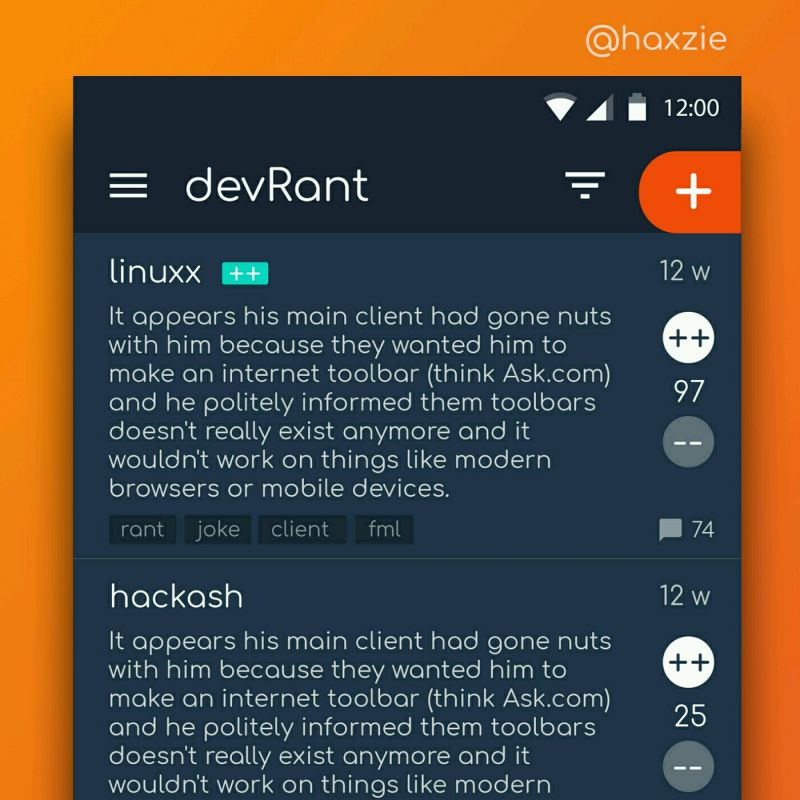 Been looking around ways to improve devrant's user experience a little, Idk whether you guys like it or not.. ...
Why do most docs have grey text color over a white background! It's just incredibly difficult to focus on. And my brain is like a potato to begin with.
rant
docs
ui