Ranter
Join devRant
Do all the things like
++ or -- rants, post your own rants, comment on others' rants and build your customized dev avatar
Sign Up
Pipeless API

From the creators of devRant, Pipeless lets you power real-time personalized recommendations and activity feeds using a simple API
Learn More
Comments
-
molaram3664284din my humble opinion they actually did a decent job at that. except all the space the controls at the right take, wtf?
-
igorsantos07256284d@molaram yep, there's a lot of space there, but I understand the need for all those buttons... but why don't they have the same style? hahaha
-
molaram3664284d@igorsantos07 I'm no expert but perhaps the first two could be removed? or at least let us style them using CSS (if not already possible?)
-
igorsantos07256283d@molaram I think you can remove with some verbose CSS, but that's not the point; they have their use, they're just... non-conforming.
-
molaram3664283d@igorsantos07 i don’t know much about that but i was happy to see all those retarded datepickers sent straight to hell from all over our codebase
-
igorsantos07256283d@molaram HAHAH IKR
I'm in a tight split between adding 200k+ to my build just for that, or just using what's supported in the wild.
Related Rants
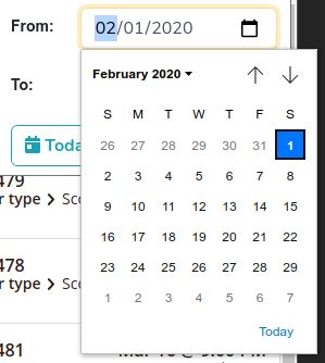
2020 and Chrome has yet to decide upon a standard style for they inner form controls.
This is a date field with:
- a blue gradient "clear"
- a gray-bg spinner
- and a transparent bg calendar dropdown
2020!!!! I don't want to use huge date pickers anymore, Chrome!
rant
html5
chrome
design standards