

Join devRant
Do all the things like
++ or -- rants, post your own rants, comment on others' rants and build your customized dev avatar
Sign Up
Pipeless API

From the creators of devRant, Pipeless lets you power real-time personalized recommendations and activity feeds using a simple API
Learn More


 No questions asked
 As a Python user and the fucking unicode mess, this is sooooo mean!
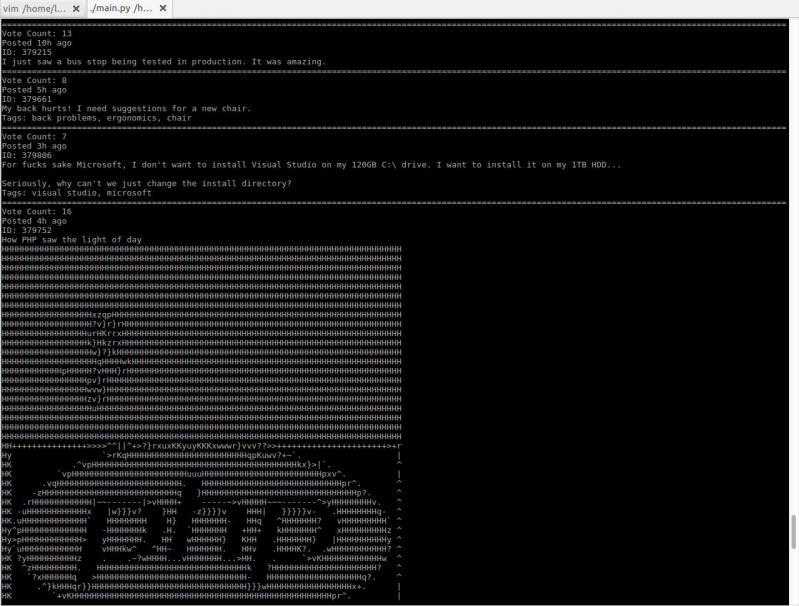 I just started working on a little project to browse devrant from terminal. It converts images to ascii art!
I'm working on a pretty Plotly map. To learn how to use bubble graphs, I've copy-pasted the example and modified it.
The example is ebola occurrence by year, Plague Inc style. So naturally I need to add some countries. For testing, of course.
Ebola for everyone! Yay.
I like my job.
undefined
python
d3
ebola
plotly
maps