Ranter
Join devRant
Do all the things like
++ or -- rants, post your own rants, comment on others' rants and build your customized dev avatar
Sign Up
Pipeless API

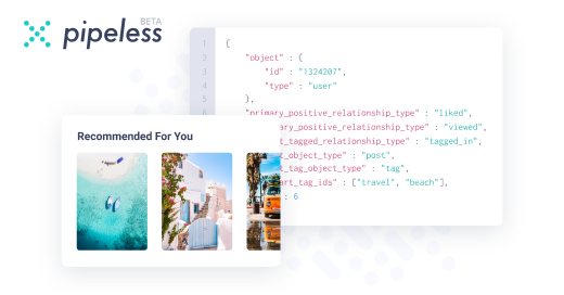
From the creators of devRant, Pipeless lets you power real-time personalized recommendations and activity feeds using a simple API
Learn More
Comments
-
 C0D4644188ySSL ✅
Mobile friendly ✅
That heading font ❓
But I’m sure your client likes it
The thin text in the footer 🚫
Hard to read on mobile.
Filter box in product search is a bit over the place in mobile layout wise 🚫
Would look at it on desktop but see my latest rant 😔 -
@C0D4 what would suggest for heading fonts and the filter I especially had trouble with ANY direction there would be awesome!
-
 C0D4644188y@TECKSPEED
The heading, maybe something close to there logo font and not as fat? Just to keep it in style.
As for the filter box, just a clean smaller list with each element on a new line? Or even just a sort by select box that can do “pricing, popular, top sellers ect” depending on data you have access to.
Filtering by price on a phone in a hidden drop box is complicated enough and hard on users. -
@C0D4 can you take a screen shot? Are you talking about the filters or the sorting of products?
-
 C0D4644188y@TECKSPEED these filters.
Although I jumped to bowling balls and the filters there are better but I think to many options listed.
As for the font, I noticed that after I typed it 😶
I just think it’s to err bold, I guess for where it’s being used.
-
@C0D4 oh shit that’s on the shop page isn’t it? Fuck I forgot about that before releasing. Definitely needs fixing...
I agree with the less bold.
I struggled with the usability of the filters on mobile and when going to bowling balls you see my final solution for the end users.
If you have any ideas of how to improve the usability I’m all ears!
How many selections would you have in the filters for category pages such as bowling balls? All of the attributes are pretty even when we are thinking about level of importance. -
 C0D4644188yThe bowling balls filters seem a good amount when looking at it, but yea that font needs to loose a few pounds .
If can you stop the page scroll when the filters are open as the select boxes are doing some weird movements that force you to close and reopen the filter menu, or add some super high z-index levels to them would probably fix it. -
@skprog thank you - as a developer I always fear it’s not good enough from a usability standpoint
-
Pros:
Nice Layout
Nice Color Choices
Nice Animation
Cons:
The jumbotron is a little fast when the user is not hovering.
Searching takes ages
overall the site is just a little slow
Overall very nice website! Definitely better than what I could do
PS: Also take a look at this link:
https://developers.google.com/speed... -
@TECKSPEED I don't know for sure...
Maybe change the way data is stored or how it searches the data. Can anyone else who has done this before help (I have never built a search)

Looking for critiques on a website I’ve been working on. Client pushed me to release it early after every time I tried to tell them to wait
Critics welcome: www.perfectaimbowling.com
rant