

Join devRant
Do all the things like
++ or -- rants, post your own rants, comment on others' rants and build your customized dev avatar
Sign Up
Pipeless API

From the creators of devRant, Pipeless lets you power real-time personalized recommendations and activity feeds using a simple API
Learn More

 Algorithm strikes again! 😁
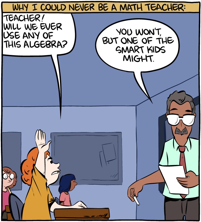 :)) finally a good answer
 Always wondered how Dijkstra came up with that algorithm!
Spent two days debugging my algo to figure it was a problem with the colors they picked and my logic was fucking flawless!
Sweetest feeling ever :D
I'm sort of color blind so I never check colors and I'm really straight about it with everyone: I don't pick colors.
Its a rant with a happy ending :)
rant
algorithm