Ranter
Join devRant
Do all the things like
++ or -- rants, post your own rants, comment on others' rants and build your customized dev avatar
Sign Up
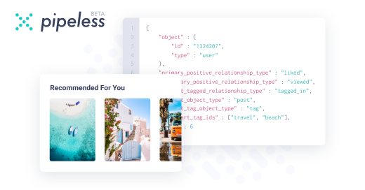
Pipeless API

From the creators of devRant, Pipeless lets you power real-time personalized recommendations and activity feeds using a simple API
Learn More
Comments
-
The sizing, the layout, the colors. It just gets worse the longer you look at it. It's amazing. It speaks to me, because that's what happens when I try to design shit.
-
Pff wording, that's almost the last thing. The first thing a user sees are colors, then sizing/design of elements. This mangled my eyes in a second, wtf.
-
@Lisanna you like the combination of colors? O.o I mean, you don't see how harsh is the difference between them? Maybe a missing panel of a color making a bridge between them?
A long ago I found this perfect tool https://color.adobe.com/create/... which can make you really good combinations of colors, pleasant for the eye and even with hex and rgb of that color. It also makes a really good bridges between all colors making them easier to process for the end user.
Related Rants

 How to vertically center in css..
 Yeah no
As someone who hates CSS/design/front end development, this abomination of a campaign donation solicitation page really has me saying, "finally, a politician who understands MY struggles!"
undefined
css
so bad it's good