Ranter
Join devRant
Do all the things like
++ or -- rants, post your own rants, comment on others' rants and build your customized dev avatar
Sign Up
Pipeless API

From the creators of devRant, Pipeless lets you power real-time personalized recommendations and activity feeds using a simple API
Learn More
Comments
-
The very first thing coming to mind is the design of the website;
- missing padding, e.g. in the navbar
- the black font is hard to read on the background
- http://contrastrebellion.com/
- on the sign up page, what's the "OR" for? there's no other option
- the footer should be at the bottom of the page (see signup page for example)
- the entire logo should be clickable to return to the frontpage, not only the logo
- the landing page should introduce one to what makes your service unique or what it looks like, else seeing "pricing" at the top, gives a very weird feeling
- colors -
@JoshBent
1) The font thing is very true
2) Thanks for the link that looks really helpful for me in the future
3) The sign up button bothers me lol -
@JoshBent thanks a lot for your feedback. A couple of things for clarification:
- the "OR" on the sign up page is for using social sign up or manually fill a form. The form didn't show up?
- apart from contrast, what did you mean by colors?
- The padding in the navbar? What's wrong there? Didn't get it.
- landing page definitely needs improvement. I do try to explain the unique points but I guess you're right. I do need to show how it looks internally. -
@creativeJuice
I am glad to help!
>>the "OR" on the sign up page is for using social sign up or manually fill a form. The form didn't show up?
Just checked in incognito, I guess I have setup some social buttons blocker since the whole facebook drama finally :)
>>apart from contrast, what did you mean by colors?
I would highly suggest googling around for "color theory" in connection with web-design, as having blue on green, doesn't look nice and makes it harder, more painful on your eyes to read
>>The padding in the navbar? What's wrong there? Didn't get it.
I have marked the bounds in red, as you can see the beta is touching the top, the signup is cutting into it and expands beyond, the logo bottom is very close to the navbar edge
(cont.)
-
@creativeJuice
>>landing page definitely needs improvement. I do try to explain the unique points but I guess you're right. I do need to show how it looks internally.
I wish I could show more examples for you to explore, but I guess some coming to mind include:
- DOs landing page, they show their internals with animations, smoothly navigated tabs etc. https://www.digitalocean.com/
- prezi which takes you by the hand while you scroll to show what makes them unique, animations, easy navigation etc: https://prezi.com/ -
@Hu-bot0x58 neither of the links flashes for me, not sure what you mean, but I am glad that some of them is useful
-
@JoshBent Thanks for clarifying. Here's what my thoughts were while making it:
The color scheme used is "Teal" as officially recommend by Google in their documentation. It's the specific hex and is used by them too for many of their documentation websites. I think it was Teal700.
I made the sign up button intentionally pop out. It's a strategy for user acquisition I read somewhere when researching.
Thanks for the links. And advise. You rock! -
@creativeJuice thanks :) imho material is rarely a good thing on the web (even google themselves abandoned it for a more lightweight design on their pages), also I am pretty sure the guidelines did have a section on what colors mix and don't mix well? if not then it was probably some medium article I stumbled upon, but the colors at their current state don't go together very well
Regarding the button, what you would need is rather a CTA, maybe even a ghost CTA, depending on how you would re-design your page or just more subtle differences, like a more bold font, more space etc. I am sure theres a lot of techniques on medium if you search for "CTA"
If you are still very certain that you want to use material design, then I remember this gave some basic components and stuff to work with: https://materializecss.com/ I have not used it myself, but people around here recommend it a lot, whenever material is mentioned -
@JoshBent thanks.
What is CTA? Sorry 😁
I might have to stick to material because the entire app, even after login, uses material design lol.
Yeah, I know that library and use a component inside after login. Mainly I relied on the basic material library from Google because it's lightweight and I did make some custom components too.
I should revisit colors for web again lol. -
@creativeJuice "call to action" like a "buy now" "sign up" etc. in the example image it would be "start your free month", usually the biggest and most "flashiest" button on the website - many websites go for a neutral color theme like white and blue and then make the actual buy button a more vibrant color outside that color theme
If you do want/have to stay with material, then you definitely have to check out some guides on color mixing, wish I could find the exact article or guideline I am talking about that had explained it in detail, but I think I can't anymore
-
@creativeJuice found some article that you might enjoy, it also mentions a tool for checking color contrast, which after I tested around for a bit, seems to be actually quite decent in detecting bad colors, I ran an example through it from your pricing page, where you have that blue "sign up" link on turqoise, if anything it might atleast help with checking if new colors are better
https://medium.com/refactoring-ui/...
https://webaim.org/resources/...
Related Rants

 Side projects..
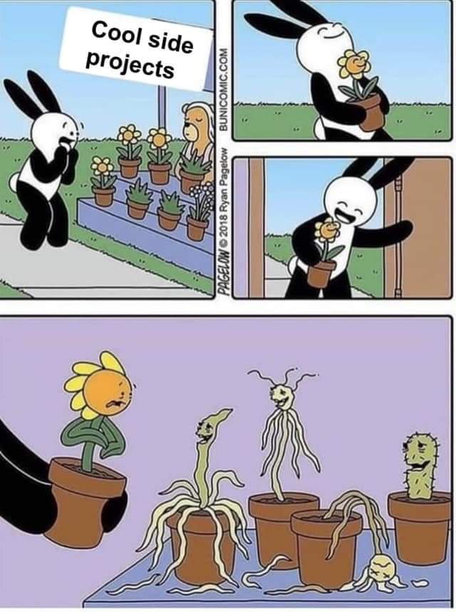
This describes the shit very accurately.
hope not a repost tho
 Reason why Devs like me can't have a Bae or a side project :
Side project showoff
Why isn't it enough to develop a tool that even the end user likes? So many challenges to get it through to the right people.
I launched this project in January. Didn't have anything to do for the year before when I got back home from my internship. So made this lol.
Any feedback is welcome.
www.kwerious.com
rant
showoff
feedback please
side project