Ranter
Join devRant
Do all the things like
++ or -- rants, post your own rants, comment on others' rants and build your customized dev avatar
Sign Up
Pipeless API

From the creators of devRant, Pipeless lets you power real-time personalized recommendations and activity feeds using a simple API
Learn More
Comments
-
If I wouldn't do designs I'd let this slip through.
- Quirky desktop search icon
- logged out icon state not fully aligned right (a lot people do this, why?!)
- reuse your mobile icons on desktop
- cannot assign plus to hamburger, missing third bar, missing context
Make your logo bolder - especially for retina/good phones. Maybe even give it some
~ ~ s p a c e ~ ~ -
@010001111 Also the fact I cba to support mobile for a **ModDB**. Mobile is designed only to visit, and manage. Anything else should be done on desktop.
-
@010001111 if nitpicking, the padding is clearly off. The logo in desktop has no padding bottom but mobile ver. seems fine.
The hamburger seems far too right.
I think the main problem is this it looks like Instagram but with a older design.
Related Rants

 My friend said an intern designed this UI for an internal site.
No. Just... no
 Credit : 9gag
Laughed so hard, that I had to defenitely post it on devRant.
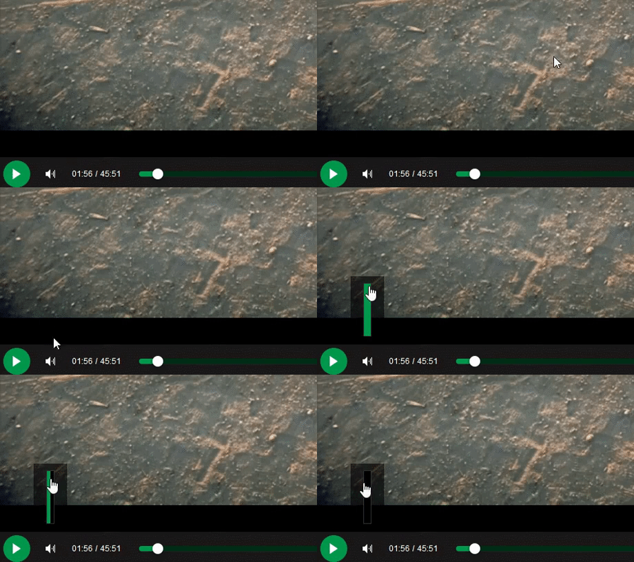
 Product dev: We need a new volume slider for ou...
Dev: Say no more!
Me: We shouldn't change anything in the design if its not broken.
Also Me:
I regret being a designer
joke/meme
ui
designer
mfw no persistence
regrets