14

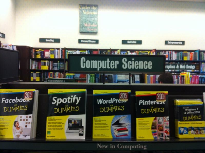
spotify UX sucks, it's so unintuitive 😩

Comments
  • 1
    How so?
  • 2
    @kiacob eg. where would you look for settings? imo it's not too convenient to place that little gear only on "library" tab, I liked that more when there were four tabs
  • 4
    @roomcayz yeah fair enough, I guess I've just been using it so long I'm just used to it . Hadn't really occured to me
  • 0
    Not available in my country.
    Couldn't be more happier.
  • 1
    Remember when scrolling to the top of a playlist on mobile would reveal a search bar?
    I miss not having to scroll to the top, open a menu, and scroll down to get that to happen.
    Or when hitting search actually opened up a search box and the keyboard, not taking to a page with popular searches first.
    Who does their UX testing?
  • 0
    UX can be simple from two angles; for new users and for old users. Personally as a new users I'd agree with you, but after using it a bit I feel like they were aiming to maximise usability for old users. It has it's flaws that bother me, case in point I tend to favour YouTube for music on Wi-Fi, but UX is pretty decent imo.
Add Comment