Ranter
Join devRant
Do all the things like
++ or -- rants, post your own rants, comment on others' rants and build your customized dev avatar
Sign Up
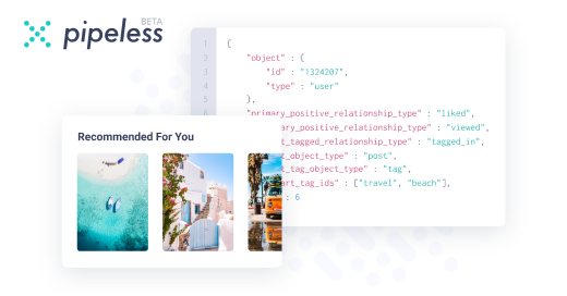
Pipeless API

From the creators of devRant, Pipeless lets you power real-time personalized recommendations and activity feeds using a simple API
Learn More
Comments
-
@BadFox I thought that too, but the whole thing is only 600px tall. I like that it has space to breathe, because when I condensed it down, it looked cramped. This is a dialog in the middle of the page, allowing you to select options for using the page.
-
 dodomo987yYou could pad the box contents or even make them centered vertically and horizontally.
I think you are on the right track with 'letting them breathe' but right now the content is just stuck to a side of the box. -
 musician6577yTo me it looks a little bit busy. It could be because almost every font has a different style. Maybe make the secondary texts less white and more transparent so they dont stand out so much?
Also maybe the start and join should stand out a bit more since they are the primary actions of the page. -
Too much free space. Try to center all the information and make the text bigger and easier to read.


Thoughts on the design?
random
one more photo in comments