Ranter
Join devRant
Do all the things like
++ or -- rants, post your own rants, comment on others' rants and build your customized dev avatar
Sign Up
Pipeless API

From the creators of devRant, Pipeless lets you power real-time personalized recommendations and activity feeds using a simple API
Learn More
Comments
-
 epse35997yTwrp is enough of a pain already on pie. Does the volume rocker change annoy you, too? Haven't gotten to try Q yet, am Quite curious
 -
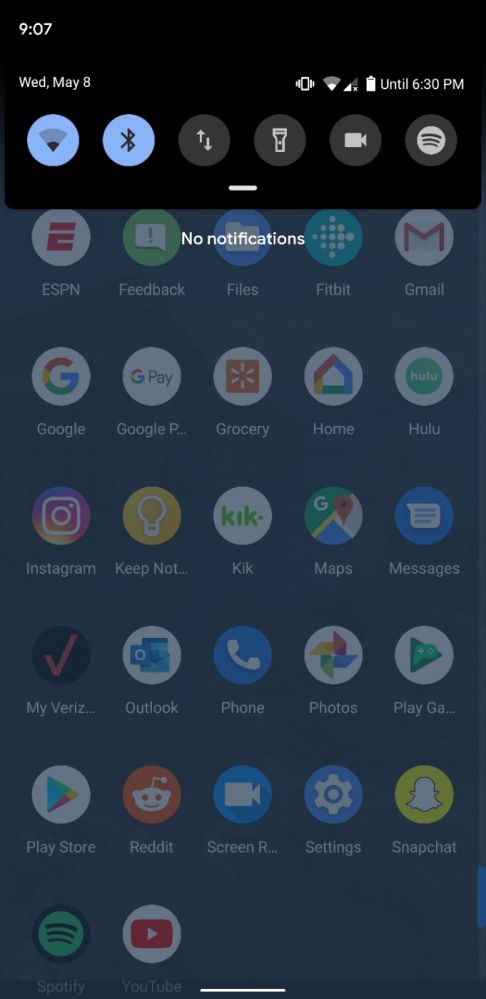
Lmk if you figure out how to fix this bullshit to show the battery percentage instead of the "until" expectancy. (I don't think it can be done yet, but it's worth a shot to ask everyone in case someone does find the way lol)
But I like it too. Especially the new gestures. I'm starting to get used to them. It'll be even better when they're perfected over the next few weeks.
-
 Condor315487y@epse now that you mention it, it appears to be on the left now, pretty odd... And then there's that huge menu for all the volume channels. They could've just put it side by side next to the little vertical volume slider.. hopefully custom ROMs will make that customizable 🤔
And it's white! System-wide dark theme is so touted about so much with this release and then there's still white shit in there 🤨
-
@epse it's annoying as fuck.
I'm on the 3XL, so whenever I set the battery percentage to always show and then I turn on say Bluetooth and/or have an app using location, then there's an issue that looks like this.
Edit: issue wasn't the correct word lol. More like a scenario that bothers me deeply lmao.
-
 Condor315487y@Stuxnet interesting.. the OP6T build doesn't seem to have that issue. It's just a regular ol' battery icon. Can't seem to get the percentage to show up on it though.. weird. It's the little things that make this a DP release I guess 😅
 -
@epse it's due to the notch being as large as it is.
I honestly don't hate the notch. But this is annoying because I use my phone in spikes. So then predicted life expectancy is ALWAYS inaccurate asf. -
@epse Yea pretty much
It didn't bother me on Pie. I actually liked it, since it kept the bar minimal.
But I could also just slide the quick settings down and see the percentage. Can't do that now -
@epse they like their battery prediction a lot, I guess.
I can't say I agree with them. Hopefully the option to toggle that will be added in one of the next updates.
-
@Alice that's fine with me.
At least it's not autistically screeching about:
-GDPR
-Article ??
-GitHub being bought by MS
Or reposting the same shitty meme 6 times a day. (Such as the front end vs back end octopus thingy.) -
 Condor315487y@Alice which is pretty much why I put it in random. If you prefer the joke/meme reposts disguised as rant or something along those lines to be in your feed instead, I'm totally fine with that.

Android Q is actually pretty cool, instabilities here and there and I can't seem to get TWRP to boot on it to get it rooted, but overall it looks pretty usable already, especially for a developer preview.. go go OnePlus 😁
random