Ranter
Join devRant
Do all the things like
++ or -- rants, post your own rants, comment on others' rants and build your customized dev avatar
Sign Up
Pipeless API

From the creators of devRant, Pipeless lets you power real-time personalized recommendations and activity feeds using a simple API
Learn More
Comments
-
 C0D4643077y@Alice 😂
True that, but this header has a few elements in the header I'm trying to find a clean way to write it, but meh, I'll write it so it sits right then rework it. It's a side project so no biggy -
 nibor46027yEither you're doing everything wrong or you're using bootstrap (maybe they're the same thing)
 -
 C0D4643077y@nibor no bootstraps found here. Really not in the mood to be overriding everything.
It's a two col header with the right col having a vertical and horizontal list in it and left col being about 70% wide and same height as right col.
If that makes sense.... -
@C0D4 Can we see the whole code? I'm a little confused as to why you need that many divs for a two column layout 😅 But perhaps there's some reason
-
Since you can't define your own elements like in xaml (windows) or xml layouts (android), it IS kind of a problem of html.
-
My trick is to only indent by two spaces, then it doesn't move that far to the right.
-
@C0D4 Haha 😂 I should be asking for code a lot more perhaps. Good work! The code looks a lot more "correct" now 🙈
Related Rants


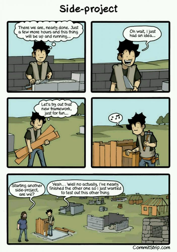
 Side projects..
This describes the shit very accurately.
hope not a repost tho
 Reason why Devs like me can't have a Bae or a side project :
 It happens all the time...
i hate my life sometimes.
as much as i can write frontend all day long and in my sleep, it never seems to amaze me how quick you can get into a deep nesting of elements in HTML.
rant
why you be like this html
only started
something new
side project
so deep