Ranter
Join devRant
Do all the things like
++ or -- rants, post your own rants, comment on others' rants and build your customized dev avatar
Sign Up
Pipeless API

From the creators of devRant, Pipeless lets you power real-time personalized recommendations and activity feeds using a simple API
Learn More
Comments
-
 Arlekin8909y@fSociety What do you mean by expand button? Because my whole point was to read without additional taps. Currently whole rant kinda works as expand button
 -
Or maybe display the full rant with an added button "See more" like Facebook. And to see the comments, you have to tap on the rant. Or something like that?
-
 Arlekin8909y@varundey
Im not quite sure i get that, do you mean like button that would expand rant, but keep the user in the feed (as opposed to tapping a rant to go to new screen with only this rant and comments)?
I guess this would work too since my main complaint is having to go between those list and detail views.
Although that's the reason i suggested it as a togglable option so if someone doesn't like long rants unfolded then has an option to leave it as is.
Anyway if i understood the ide of expand button correctly then im all for it -
@Arlekin that is exactly what I was suggesting. My concern with your idea is that it will expand all the rants by default, even the ones which are not very interesting
-
 macbury12529yWhat about this. You long press on rant and it opens in modal with full rant and comments?
 -
 Arlekin8909y@macbury
Modal wouldn't be that bad given it'd be easy to dismiss.
But thats only for people with big screens - so there is that.
@varundey
I get your point. IMHO having that kind of expand button seems like best of both worlds right now. -
This would be super useful for me. Though probably not a common case, I actually don't get mobile Internet on this device (I'm actually happy about this except when I want to use gps), so I like to preload the rants, which means i can't read rants that go over the limit.
-
*long* tap to expand any rant to full text would be a cool feature. I don't mind tapping a rant to view the whole thing but it is a bit slow if you just want to see where it's going..
-
@Arlekin basically the see more btn like FB.
That way you avoid going going a level deep. Maybe combined with the swipe left/right option so you can quickly get to/from the comment area.
Having to click the top left is troublesome on larger screens.
Related Rants

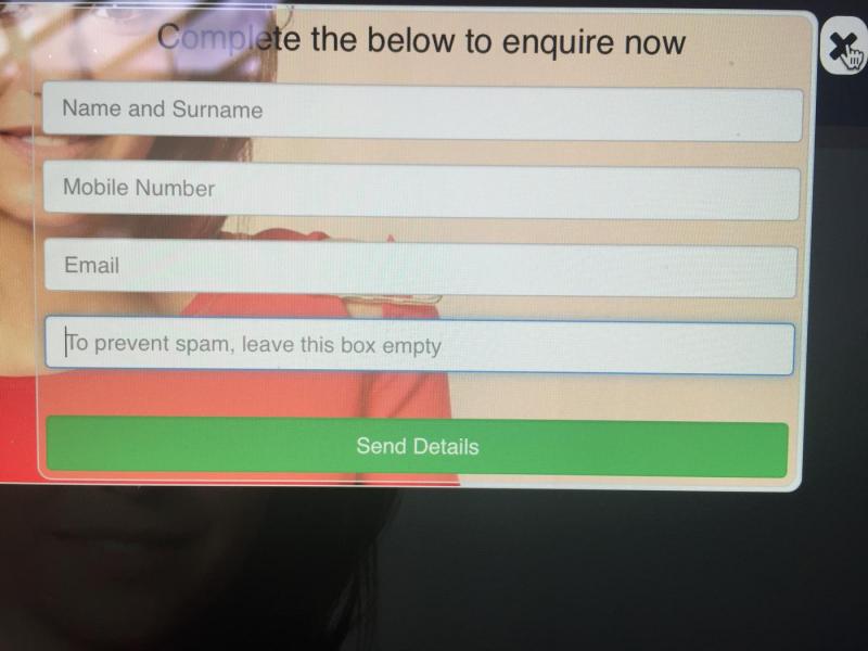
 This is gold. This developer has a bold captcha solution.
 Most of semi active Github projects be like...
 If you're going to bother to detect that my input is without hyphens, then you can certainly insert them for m...
@dfox Feature request
Could we have fully displayed rants ? Maybe as a setting disabled by default ?
I mean sometimes i'd like to relax and just mindlessly scroll, and having to tap to read longer rant and then tap back is, well, too much.
Especially when the rant ia only like 2 words above limit.
undefined
lazy
feature request
pretty please