Ranter
Join devRant
Do all the things like
++ or -- rants, post your own rants, comment on others' rants and build your customized dev avatar
Sign Up
Pipeless API

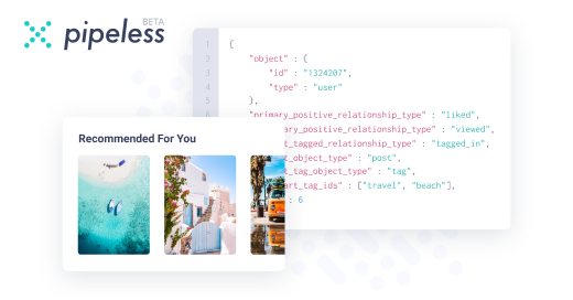
From the creators of devRant, Pipeless lets you power real-time personalized recommendations and activity feeds using a simple API
Learn More
Comments
-
Lexter11345y@F1973 I can't care less about avatars. In fact, my brain skips them. Just like adds.
-
 C0D4644185yCopywriter needs to lean to write another sentence or two to handle the offset of that huge ass image.
But otherwise... it's just mobile first with a fuck tonne of whitespace. -
Lexter11345y@F1973 More like they do it for themselfs. Cuz it looks clean. I see no benefit for user. Mobile first does not mean make everything bigger with less informations.
-
Lexter11345y@F1973 At least designers i working with doing it. Clients does not realy care, in most of the time. Clean design, fine, simplify information's, sure, not then chase the rest of the place with size of elements and empty spaces so you can read what the company do in freaking 10 screens. So anoying.
-
Lexter11345y@F1973 Some designers are cool, sure. I'm not gonna name them. Designers who using this technique juste because something funky happening in their brains, not. Look at awwwards, dribbble or whatever. It's a cool showcase, but more like freak showcase.
-
@Lexter Are those designers UX designers?
Or was this UI design based on a UX prototype (or at the very least the wireframe)?
If the answer is yes to either question, then that's what the target audience wants or prefer (assuming the User Research was done properly and that it coincided with the user persona).
I mean, as someone with a fair amount of UI/UX/HCI knowledge, it seems like the design needs some rework (notably the font size and the image/typography balance) but if that's what the targeted users want then I don't see any issues with it. -
Lexter11345y@Berkmann18 I ranting about the whole trend. Not about some users want it. No, there was no research, this specific designer making everything bigger since he bought big ass retina haha. But that's not the point.
Well, if majority internet users want this style, than be it. It's just wierd, majority if designer showcase websites are full of that crap. Looks like everybody want it. I just hate it, that's all. -
It's stupid splash pages just by different technical means because designers failed to grasp WHY splash pages sucked.
-
Don't see anything wrong with the design as an impact screen, but 8 of these, yeesh. Somebody needs a good hard smack.
Related Rants

 A bit more red....
I hate this trend. Take up the whole screen for one big nothing. Yep, 1920x1080 is apparently not enough to show me more than motto, one link and freaking big image nobody care about.
Fuck, i must code it. Oh damn, there is 8 same sections on the whole page. Don't worry, not a single one of them worth reading! FUCK YOU designers!
rant
bigger is better
designers