

Join devRant
Do all the things like
++ or -- rants, post your own rants, comment on others' rants and build your customized dev avatar
Sign Up
Pipeless API

From the creators of devRant, Pipeless lets you power real-time personalized recommendations and activity feeds using a simple API
Learn More


 !rant, HTML is the toughest
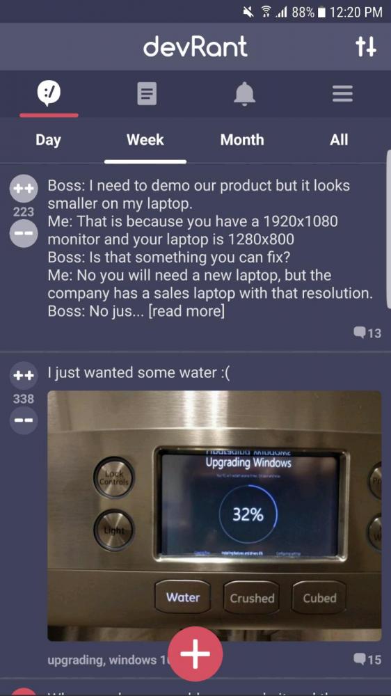
 We got a winner here!
That guy should be remembered.
We got a winner here!
That guy should be remembered.
 !Rant
So the interns tried to 3d print a rubberduck and it got stuck mid way.
Guess i have a coding duck no...
!Rant
So the interns tried to 3d print a rubberduck and it got stuck mid way.
Guess i have a coding duck no...
!rant
I really like the Material Design guidelines that Google has released with Android 5.0, and maybe, @dfox, you could make the status bar match a darker tint of the app's color, as this color is also used on the recents menu and on my keyboard, and it really (IMO) makes an app stand out.
Thanks!
undefined
tinted status bar
material design
!rant