Ranter
Join devRant
Do all the things like
++ or -- rants, post your own rants, comment on others' rants and build your customized dev avatar
Sign Up
Pipeless API

From the creators of devRant, Pipeless lets you power real-time personalized recommendations and activity feeds using a simple API
Learn More
Comments
-
Because it was nice to be eye struck with Heaven the first time you opened the app.
-
 isarant1139yI actually find dark themes have more strain on my eyes (looong time developer). You have the option to set the way you like already, why jump to conclusions thinking that should be the default for everyone?
 -
 kavenc6319yMaybe what Devs need is *switching* to dark theme, which makes me feel better. I think most of the dev tools are in bright theme by default. We just enjoy switching them to the dark side....
Just saying. -
A better option would be to have an onboarding screen where a choice can be made.
-
@kavenc good point, it's a rewarding design decision.
"Yes i managed to switch devrants dark theme, I'm awesome!" -
Tbh, the dark theme was the reason I signed up.
I was using the app for a while, just reading and laughing when I saw someone rant about the themes, then I realised there is a dark theme and decided to sign up in order to use it.
Related Rants

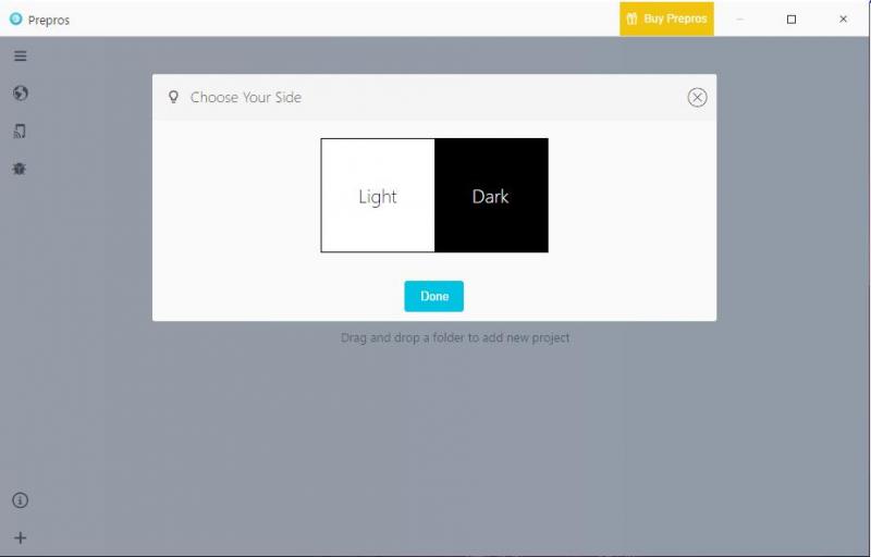
 This is how every app should start...
Why not make the dark theme the default? Most of us developers use it for most things, so it seems appropriate to set the dark theme as default.
undefined
dark theme
default