
Ranter

Join devRant
Do all the things like
++ or -- rants, post your own rants, comment on others' rants and build your customized dev avatar
Sign Up
Pipeless API

From the creators of devRant, Pipeless lets you power real-time personalized recommendations and activity feeds using a simple API
Learn More
Comments
-
First, computers were too weak for a beautiful UI. Then flat design happened. In the short time between, there was Win 7.
-
ngl I hated win 7's design, it just felt like a halfassed effort that was trying but not there. Modern flat design looks sooooo much better, although fuck rounded corners in general.
-
@RememberMe @ostream I guess am just suffering from a case of nostalgia, being that windows 7 was my first OS until I found out linux was a thing
-
@RememberMe I think it looks like Windows 2.0 or something. Only back then, it was technical necessity while now, it's laziness, in particular with flat icons that look like toddlers made them.
-
@Fast-Nop flat design is definitely not "laziness", I like how it's easier and clearer to read. You're also conflating flat with minimalism, that needs to be managed properly too. I'm not saying win 10 etc do it better, but some areas and some apps do.
To me Win 7 UI feels bloated and unnecessary, like it's drawn with a box of thick crayons. I'd prefer clean light sharp lines. -
@RememberMe Just look at the newer icons since flat design. Doesn't matter which ones, it's not even Windows specific, although the Windows icon itself is a good (i.e. bad) example. That's sheer laziness.
Another problem that flat has always had, and that was somewhat alleviated with material, is the lack of cues that you can even operate parts of the GUI. You have to already know the GUI in order to even use it, and that defeats a central point why GUIs won over CLI for users, though glossy buttons back then were over the top sometimes.
Another good thing about Win 7 was that Aero Glass was totally optional. That's how Win 7 was good both for people who liked it, and those who didn't. -
@Fast-Nop Some go too far (but it's not like all icons before flat were nice either), but I actually like most of them. Much clearer for me especially with my huge ultrawide display and tons of stuff going on on the screen usually.
Yes, interactivity is a bit of pain and material does handle it well, but in practice I never found it a problem as such. I'd take a different suggestive color or luma over a inflatable balloon gradient colored button any day :p as long as I'm trained by the UI to accept consistent cues, I'm fine. In general the bigger problem in complex software is usually knowing *when* to interact with a control and in my experience flat does as well as any other kind of design there and for me slightly better because my dumb brain reacts well to strong color and luminosity cues.
Oh I didn't mean Aero Glass, though I found it cool at first (esp in Vista) but got tired pretty quickly. -
Flat is simple, it's hardly anyone's favourite but it's also hardly anyone's least favourite. The idea in it that I really like is that style should be a property of content and not dictated by the OS, browser, email client, file manager, etc. I specifically like that it's meaningless and neutral, simply a collection of design best practices. It matches perfectly to the role of an OS, being an efficient and purpose driven shim between software and hardware. It's kind of ironic how well Microsoft executed this idea in design and how miserably they failed in practice.


Related Rants

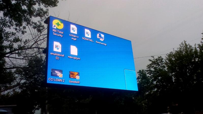 Windows 7 never dies.
Photo taken 10 minutes before a huge rain.
Windows 7 never dies.
Photo taken 10 minutes before a huge rain.
 I was trying to get some cash from an ATM. Instead of vending bank notes as it should, this happened...
I sti...
I was trying to get some cash from an ATM. Instead of vending bank notes as it should, this happened...
I sti...
 Look what I achieved today in Windows 7. Felt good. Today is a good day....
Anyone remember windows 7, clear windows and a green highlight , someone make me 12 again
random
windows 7