Ranter
Join devRant
Do all the things like
++ or -- rants, post your own rants, comment on others' rants and build your customized dev avatar
Sign Up
Pipeless API

From the creators of devRant, Pipeless lets you power real-time personalized recommendations and activity feeds using a simple API
Learn More
Comments
-
The first and third are the same, but the first is in touch mode. This is actually an intelligent choice by ms, making buttons bigger when the screen is tapped as opposed to clicked.
-
Microsoft is still failing to recover from the whole Modern UI SNAFU of Windows 8. Too much functionality remains from Windows 7 and the UI is just carried forward. It's a total shambles.
-
 aaxa22009yOkay, so one of them is optimised for touch. That doesn't mean the rest is A-OK. Because it's not! It's dumb to make a menu in that many ways in the same OS
 -
@dontbeevil I'm not sure about that. I get it they were designed to work with both mouse and touch, but I don't think they change. I still think it's a shambles from a UX perspective.
Related Rants

 No, thank you.😆
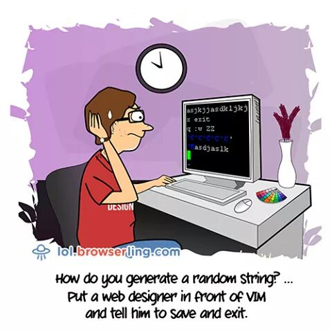
 The real random generators!
Microsoft's Design Guideline
undefined
microsoft office is still the best
random