
Ranter

Join devRant
Do all the things like
++ or -- rants, post your own rants, comment on others' rants and build your customized dev avatar
Sign Up
Pipeless API

From the creators of devRant, Pipeless lets you power real-time personalized recommendations and activity feeds using a simple API
Learn More
Comments
-
I shit you not, I recently saw a medical document completely written in Comic Sans.
Their excuse? "We're treating kids, it cheers them up."
Apparently, parents dig it to read about their kid's health problems in a fancy comic font. The more you know (I've never seen a kid read a 10 page medical report). -
 kitsune1257yI had my TA hand out lab report manual (15 pages) written in Comic Sans. And no, my instructor had nothing to do with that manual.
I'm in the second year of my bachelor's. -
@Nanos you probably have dyslexia.
Comic sans (and other dyslexia-proof-fonts) should always be favorized IMHO. -
@Nanos
tl;dr:
Sans-Serif: Quick to read, Professional, but Unpersonal.
Monospace: Allows clear recognition of all chars. Slower to read.
Serif: Quick to read on paper, more "personal". Slower on screen.
Go with a sans-serif font (with, perhaps, the exception of Impact, think FreeSans or Arial) - easy to read and in a sentence with context, you don't have to distinguish between things like I vs l because the context gives the word away anyway.
Otherwise, a monospace font (Courier New, Lucida Console) allows clearly recognizing those differences - that's why they're popular for terminals and IDEs.
A serif font CAN be easier on the eyes on paper - but it's a pain to read on screen, so avoid it on the web unless it's only a short text (1 liner). These are the fonts that you have the most issues with.
Fantasy fonts (Comic Sans, Lucida Handwriting) are okay in a context where they make sense, but they're equally slow to read. -
 620hun80997yI don’t remember the technical term, but apparently fonts with those horizontal lines at the bottom of the letters are easier to read. So Comic Sans is actually not easily readable.
By the way, I’ve seen renowned academics presenting in Comic Sans, it was very conflicting. -
@irene Interestingly, there IS an ongoing scientific controversy about that (the 1000 char limit stopped me from mentioning that).
The Merriam Webster writers manual said it's easier to read, but others say that it reduces reading comprehension.
Serif is old - as old as the Latin alphabet, it was used in ancient Rome. That's probably where it's seen so frequently. Probably, it's by habit that some people can read them quicker. -
 Moof847y@Nanos the obvious answer to that is Dyslexie, or the Free alternative, Opendyslexic. A lot of people who find Comic Sans easy to read find those fonts even easier. And it’s not that you are necessarily dyslexic, it’s just that the optimisations in the font help in general.
 -
@irene Comic Sans does not follow basic typography rules. For example, the horizontal line in "e" is not horizontal. It makes it harder to read (though I didn't know it was dyslexic-proof).
Also, as it is a "default" typeface for most non-designer, it feels cheap.
But as most article says about it, it's more about context than anything else. Comic Sans is useful in some cases. -
@irene Well I'm not a designer, but I'd say that we're not using the same definition of 'easy'.
The typographic rules mentioned above make a text easier to read (i.e. you read it faster), but can be confusing for a dyslexic person.
A dyslexic-proof typography does not follow all those rules, making similar letters easier to differentiate, but this reduce your reading speed.
Take a look at OpenDyslexic. It follows more rules that Comic Sans, but is still dyslexic-proof.
https://www.opendyslexic.org/
-
@irene Typography is used to give a publication or letter a certain touch or appearance.
Most people associate serif fonts like Times with fiction or entertainment-related books - novels and the like. Not meant to be read quickly but to be enjoyed.
Sans-Serif (like Arial) makes something appear more business-like. Serious, informational, easily skimmable. For example, download an investor-information sheet from, say, Lyxor or Comstage. That's sans-serif.
Comic Sans makes things appear childish and immature. You can use that in, say, a comic, but imagine you bank statement journal in it - bad, right?
Cursive fonts (Lucida Handwriting) makes things appear more personal. Marketers love to use that, even though most people immediately realize it's "only" printed.
Monospace can be used to make things look old-fashioned, technical or scientific depending on the font. Its immediate use was to have all characters have the same width and a distinctive look. -
 Root772337yI sometimes use comic sans intentionally to annoy techy people.
It works every single time. 😁


Related Rants

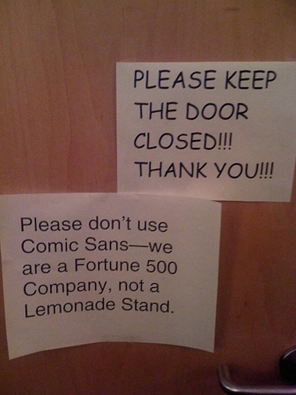
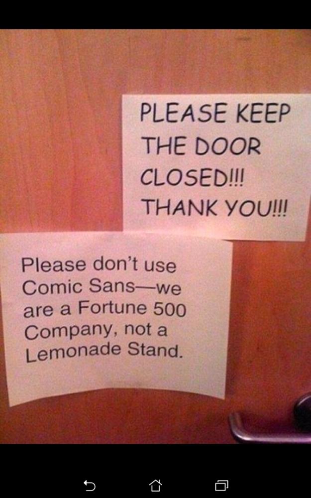 please don't...
 I have a confession to make.
I do most of my java coding in comic sans ;-;
IT MAKES ME HAPPY FOR SOME REASON
I have a confession to make.
I do most of my java coding in comic sans ;-;
IT MAKES ME HAPPY FOR SOME REASON
 Comic sans 😂
This is what my roommate got handed to him at a lecture. Completely written in Comic Sans, everything is in fucking comic sans and it is not a joke! 🤣
random
old people
comic sans
computers