

Join devRant
Do all the things like
++ or -- rants, post your own rants, comment on others' rants and build your customized dev avatar
Sign Up
Pipeless API

From the creators of devRant, Pipeless lets you power real-time personalized recommendations and activity feeds using a simple API
Learn More


 When you are so lazy to make a dark theme so you just add warning.
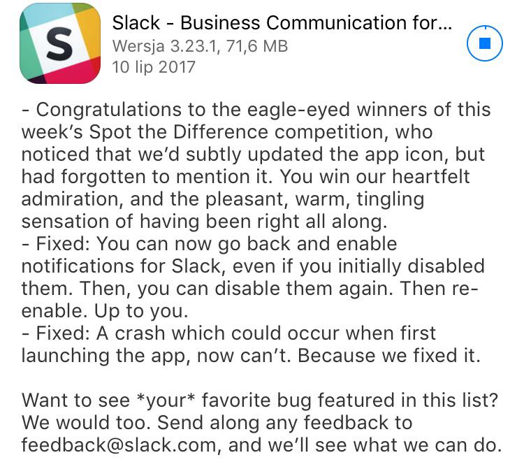 I love the Slack changelogs 😂
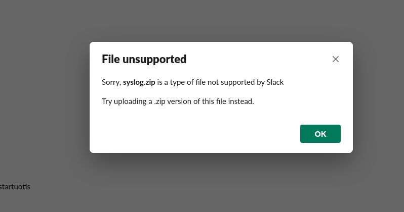 oh boi
Why? 😑😑
joke/meme
slack