Ranter
Join devRant
Do all the things like
++ or -- rants, post your own rants, comment on others' rants and build your customized dev avatar
Sign Up
Pipeless API

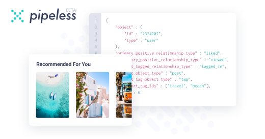
From the creators of devRant, Pipeless lets you power real-time personalized recommendations and activity feeds using a simple API
Learn More
Comments
-
Top left. Though if I may give some advice;
1. The ones with colored backgrounds doesn't work because of the low contrast between the looking glass and the background.
2. Somehow make the white part of the looking glass contrast the background. You have to make sure that the logo works in most places.
3. Use another font. If you want to go with a serif font, use one that's a bit more defined. Else, just use a sans-serif font. The one you're using right now kinda makes it look like a Chinese label or something.
4. Center the T in the looking glass. Looks like it's a bit off.
5. Make the text bigger. That will never show if the logo is used in a tight space. Alternatively only use the logo with the text if you have a lot of space to work with.
I like the color, btw. -
 Root770736yThe color is great.
I especially love it when the color matches the background. 😉
Anyway, @ScriptCoded (and @odite) are correct. Anything I would say would just reiterate their points. -
I'll go with the whole four combined as one logo with second and third switching sides.
Related Rants

 It all makes sense now...
Which looks better?
rant
logo designing
android
java
android dev