Ranter
Join devRant
Do all the things like
++ or -- rants, post your own rants, comment on others' rants and build your customized dev avatar
Sign Up
Pipeless API

From the creators of devRant, Pipeless lets you power real-time personalized recommendations and activity feeds using a simple API
Learn More
Comments
-
I consider message boxes to be bad user experience. That's why I rarely use them. So, when users see them in my applications, they know it's serious. This would be one case where I would put a message box.
-
@WerewolfCustoms I agree, but in this case you could get rid of the possibility of a misclick (and a pop up for confirmation) easily by separating the two buttons apart.
I agree you may not have another area in the screen to place the button - which is not the case for the particular system I am ranting about - however if this happens at least make the delete button red, or whatever, to contrast the operations and convey different meaning from two similar objects close together - not the particular case either.
Related Rants
-
 bjorngi24
 The aCalendar app let's you choose vibration pattern, it's one of the better settings I've seen.
 -
 aswinmohanme17
 When you take User Experience to the next level. Just what I was thinking
Credits : Riot App
 -
 htlr79
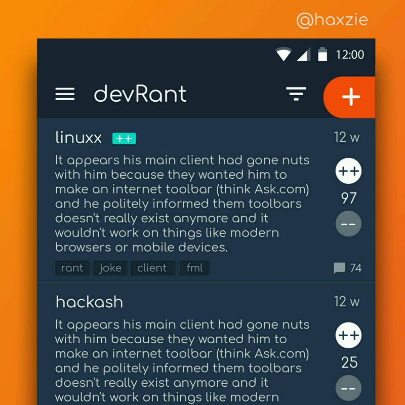
 Been looking around ways to improve devrant's user experience a little, Idk whether you guys like it or not.. ...

I just want to say FUCK YOU to the guy who had the great Idea of putting the EDIT button 10 pixels away from the DELETE button on this internal batch processing scheduler tool.
undefined
misclick
click to lose all your fucking job
ux