
Ranter

Join devRant
Do all the things like
++ or -- rants, post your own rants, comment on others' rants and build your customized dev avatar
Sign Up
Pipeless API

From the creators of devRant, Pipeless lets you power real-time personalized recommendations and activity feeds using a simple API
Learn More
Comments
-
Go to the rant feed, then the big red plus at the bottom. Actually, viewing one's profile isn't the main view - the rant feed is.
-
@Fast-Nop Oh right, the big plus that completely blends in with the page and looks like a "load more" button.
-
 theuser46456yYou are right, but as I can understand, this website is a weekend/side project created by two guys. It does not have a pool of designers and developers working on it.
Bad UX (and anything bad) still happens in 2020 because you may not have the knowhow at your disposal. -
Hey love, the maker of the site isn’t the best designer and the guy who helped him also did sloppy.
But the community counts, not the usability, right?
But hey, at least we’re honest and I’m trying to fix that! -
@junon Yeah, that should have a label, which would also be consistent with the "Add Comment" button in the rants. Also, the colours should be more consistent (Plus is red, Add Comment is purple, Post is red again).
What's worse however is that these buttons aren't properly debounced. Clicking or tapping them twice performs the action twice. That would be trivial to add in the handler. -
 C0D4643076yWebsite is a subpar experience, download the appropriate mobile app and enjoy a better* devRant.
*better as in green grass an oceans compared to a swamp. -
@C0D4 Switching from a big monitor to a tiny screen and then even lacking a proper keyboard doesn't promise a better experience.
-
The Website is just for Social acceptance, DevRant's primary focus is on mobile app, Also, it's better you didn't find post button as you should explore this platform before posting. Many Green Dot Newbies post Cringe content before knowing what the platform is about.
-
@theabbie "green dot newbies" wonderful way to convince people to use the site.
Also, I'm not downloading another app, I'm actively trying to use my phone less anyway. If this site isn't going to be around much then surely don't see a point in using it.
Also, why are people gatekeeping rants? There's a rant there by itself. -
@junon I did not understand your last question, also the "green dot newbie" problem is bigger than it appears, Spend some time here and you'll see how much shitpost happens. We're fun people here, you'll love it.
use this alternate electronjs client if the desktop website seems bad.
https://electronjs.org/apps/...
Also, If you want to join our Discord server,
https://devrant.com/collabs/...
You might make some good friends.
Good first rant, Welcome to the community. -
@junon We only refer to green dots when it's content is inappropriate. Like with the indian wave and presumably now with the tiktok coders.
++'ed for proper first rant. It's in a rough state as of now, but maybe you'll enjoy my alternative client.
https://github.com/dr010001111/...
It should streamline web, android and ios. -
@010001111 @theabbie Hey you guys were 100% right, my apologies. Green dots suck.


Related Rants

 My friend said an intern designed this UI for an internal site.
No. Just... no
My friend said an intern designed this UI for an internal site.
No. Just... no
 Product dev: We need a new volume slider for ou...
Dev: Say no more!
Product dev: We need a new volume slider for ou...
Dev: Say no more!
 Been looking around ways to improve devrant's user experience a little, Idk whether you guys like it or not.. ...
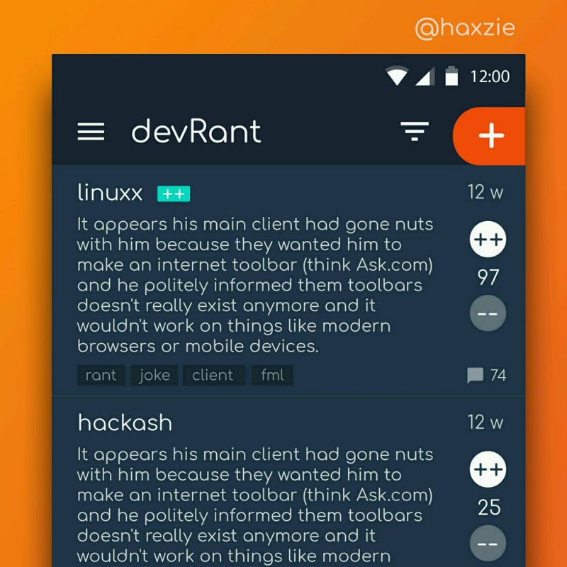
Just signed up for this site, took me three minutes to figure out how to post a rant.
Do the designers know what a call to action is? Where in this screenshot tells me "post a rant here" or "click here to write your first" or "new rant" or even a plus symbol, pencil, paper, or any sort of symbology?
Nope. It's in a vague, almost invisible menu with a symbol of three dots that usually means "things you don't normally use might be in here". The main function of the site. Tucked away where nobody can see it.
Bad UX has no excuse in 2020.
devrant
ui