Ranter
Join devRant
Do all the things like
++ or -- rants, post your own rants, comment on others' rants and build your customized dev avatar
Sign Up
Pipeless API

From the creators of devRant, Pipeless lets you power real-time personalized recommendations and activity feeds using a simple API
Learn More
Comments
-
Your article asks where the content has gone. It also has a deco left sidebar that adds nothing of value, but distracts from the content, and is especially enerving when scrolling. Even worse on mobile because it steals precious screen width.
That's also why UX has become bad - because people add bling bling just because they can without ever thinking whether it is really useful. -
@Fast-Nop Together with that font. Especially colons are barely visible.
And the images are not sharp. I can't see anything! Or do I do I have to click on every single picture? -
@sbiewald I didn't have issues with the font because my adblocker blocks Google Fonts, but without blocker - O-M-F-G. What train wreck is that crap? And then complaining about UX and content being pushed away? WTF!
-
@fraktalisman
Do you mind some other feedback / comments?
Your article would profit very much if you pointed out the issues by highlighting them in the picture or at least place the picture right before the issue you show.
May be constructive and ideally show positive examples (e.g. cookie banners: Github got rid of them perfectly legally by not tracking their customers!).
Anyway, maybe an answer to your initial question, why the UX sucks: Everyone* else is worse ;)
*not everyone, but most likely every relevant(!) competor -
@Fast-Nop fair play and thanks for being critical. It's me who has been blind about my own blog.
-
@sbiewald you too, thanks for your feedback. I will definitely change my theme, and I will update the gallery as well.
-
It seems devrant, while seemingly more rude at first sight, can at times be more helpful than StackOverflow with its strict rules on what to post and what to delete XD
Related Rants
-
 bjorngi24
 The aCalendar app let's you choose vibration pattern, it's one of the better settings I've seen.
 -
 aswinmohanme17
 When you take User Experience to the next level. Just what I was thinking
Credits : Riot App
 -
 htlr79
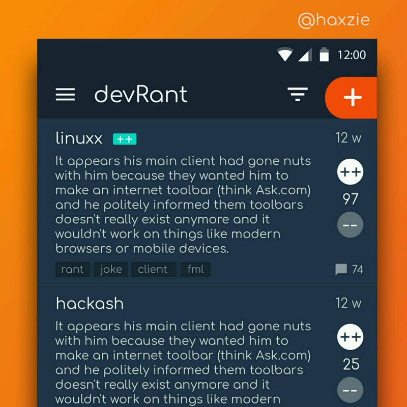
 Been looking around ways to improve devrant's user experience a little, Idk whether you guys like it or not.. ...

When I visited a social network after a while, I could not believe my eyes …
Seriously: why are so many large and successful websites so user-unfriendly? Is it only me, or is it bad UX design? Am I just getting old?
A short elaboration on effects and reasons, with links and screenshots, in my new blog post:
https://open-mind-culture.org/en/...
rant
ux