Ranter
Join devRant
Do all the things like
++ or -- rants, post your own rants, comment on others' rants and build your customized dev avatar
Sign Up
Pipeless API

From the creators of devRant, Pipeless lets you power real-time personalized recommendations and activity feeds using a simple API
Learn More
Comments
-
IDK, the user is getting the experience they want.
The design is still intact, if adjusted a bit by the users.
This project meets all specified requirements. I see nothing wrong here.
Plus I love a good desire path. -
 nibor46025yBuild big fences to stop people walking where they like!
The same approach taken by Atlassian UX designers. -
@nibor I thought the same. Whose mistake or who’s mistaken.
But I didn’t wanna be a bitch so I didn’t comment on it 😅 -
@Nanos The thing is, UI is not very comparable to a park. While UI should be practible and efficient, a park may be not. Most of the time, it shall be beautiful to look at and even naturally slow down the people walking through it to be more relaxing.
So, completely different to UI design, the mistake in this picture is to allow taking the short route. There should be barriers, either a fence/hegde or, if the grass area should still be accessible, more benches (people mostly avoid walking near other people) or natural obstacles like larger rocks. -
Every time UX is mentioned, I hear Steve Jobs shouting "YOU ARE HOLDING IT WRONG!!"
Related Rants

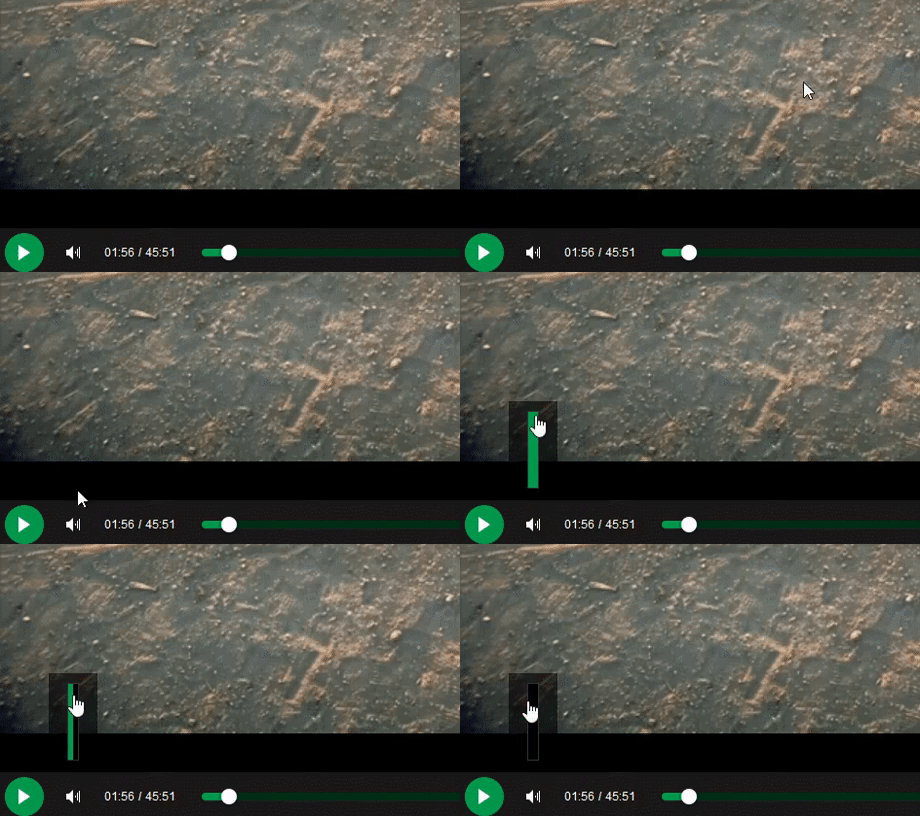
 My friend said an intern designed this UI for an internal site.
No. Just... no
 Credit : 9gag
Laughed so hard, that I had to defenitely post it on devRant.
 Product dev: We need a new volume slider for ou...
Dev: Say no more!
Who’s mistake😂😅
joke/meme
software development
designer
ui/ux
ui
ui design