Join devRant
Do all the things like
++ or -- rants, post your own rants, comment on others' rants and build your customized dev avatar
Sign Up
Pipeless API

From the creators of devRant, Pipeless lets you power real-time personalized recommendations and activity feeds using a simple API
Learn More
Related Rants

 So as new user I used devrant straight for 6 hours and this happened.
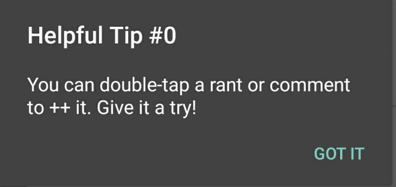
Am I the only one who thinks this helpfu...
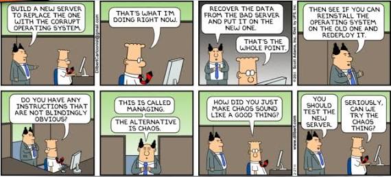
 this guy and gilfoyle are my heroes..
Hey @dfox , after using this awesome app for some time now I thought about Posting some feedback about some stuff which may can be improved in future releases:
Maybe it would make sense to seperate the notifications in two areas: one area for your received likes and one area for comments made on your posts or posts you comments on. I often find myself not seeing when someone commented on a post because of the many like notifications.
Speaking about the likes I sometimes click on the Username to see who liked a post. If you don't hit the username you are taken to the post instead of the profile. Maybe it would make sense to make the username a little bit bigger or give it some button like layout to make it easier to click, because I often find myself not hitting the username correctly.
Dark Mode is a great Feature, but it would be even better if you could choose when to use darkmode and when to use lightmode based on time maybe, so that those two themes automatically switch.
These are just my 2 cents, which in my opinion would make the app even better than it is and which you may consider in some future releases.
All in all I really like this app and the Community is great, so thanks for creating it. :)
undefined
suggestion