Ranter
Join devRant
Do all the things like
++ or -- rants, post your own rants, comment on others' rants and build your customized dev avatar
Sign Up
Pipeless API

From the creators of devRant, Pipeless lets you power real-time personalized recommendations and activity feeds using a simple API
Learn More
Comments
-
 hell164538yOld school people tend to not have a fucking clue how to "internet" and those kinds of companies jump into the web and do these kinds of suicide movements.
 -
This. All of this. Or "Top 10" lists that refuse to put all 10 items on a single page, and instead put each item on a separate page and force you to click through 10 pages so they can register more site hits, increase browse time stats/decrease bounce rate stats, and serve more ads to you because now they can serve you 10 different sets of ads on 10 different pages as opposed to just 1 set of ads on 1 page
Also, it drives me freaking nuts that Netflix autoplays video previews if you hover over a title for more than
.0000000000001 seconds. Like I just want to answer this text real quick so I have to stop scrolling for a moment, I don't want to have this trailer for "He Named Me Malala" shoved down my throat for the 1000th time just because I hovered over the title for a millisecond
Related Rants

 My friend said an intern designed this UI for an internal site.
No. Just... no
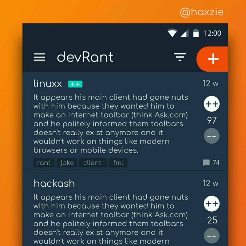
 Been looking around ways to improve devrant's user experience a little, Idk whether you guys like it or not.. ...
Hashedram's compilations #1
List of most annoying website designs.
1) Pages with AUTO PLAYING VIDEOS.
Yes I'm looking at you Netflix. Along with every news website known to man. I'm looking to read a fucking article, so why would you even waste your money and bandwidth trying to shove a video of some shit I don't care about in my face, and make it follow me as I scroll down like a fucking insecure puppy. Also, fuck you Instagram.
2) Pages that redirect once immediately after you visit them, thereby fucking with the browser history and the BACK BUTTON just leads back to the same fucking site.
I mean, just why. Did you think I would just go "Hey the back button doesn't work so let's stay on the site and read their awesome content"?
3) Sites showing things in a SLIDESHOW, when it actually should be in a list.
Slideshows are for progressive stories or for showing lists where you don't care about what's in them. Top 10 foods that reduce weight. Slideshow 1/15. Fuck you.
4) LOOKS LIKE YOU'RE USING AN AD BLOCKER
Yes. Yes I am. No I will not turn it off for you, you narcissistic snowflake fuck. And don't even try to guilt shame me into turning it off, because I know you're just going to bombard me with videos of sexy singles in the area if I do.
5) Pages where I see the first 3 lines of an article and have to SUBSCRIBE to see more.
Yes. Brilliant fucking idea. A user wants to see what your site has to offer, so within the first three seconds, don't show him exactly that.
6) Looking up an article and having to read through the entire motivational life story of the author.
I just want to know how to boil eggs, not read about your journey across Africa learning how to make difference recepies using boiled rhino dung.
7) CLICK BAIT.
Title: School boy designs blockchain machine learning game engine
Actual Content: Tic tac toe program made using linked lists
rant
hashedram compilations
design