
Ranter

Join devRant
Do all the things like
++ or -- rants, post your own rants, comment on others' rants and build your customized dev avatar
Sign Up
Pipeless API

From the creators of devRant, Pipeless lets you power real-time personalized recommendations and activity feeds using a simple API
Learn More
Comments
-
I think the top one would be creepy as well without the heart symbol.
And now that I've thought that, it's creepy even with the symbol. -
In other context, the first one may be the last line of a love letter or a gift. Is it still creepy?
-
To be honest, if the message was sent by a boyfriend to his girlfriend, or vice versa, I think the font n°1 would be great, with or without the heart.
Of course, if you're gonna start talking about stalkers, and creepers, the font wouldn't even matter, as the situation is creepy on its own. 🙄
Or that's what I think anyways.
:3 -
 djlazz313438y@nightowl poor adults and children... They'll have to die for the power company's sins... 😂


Related Rants
-
 nuhaf26Teaching 7-8 year olds the basics of web design. We're we're playing with CSS and changing colours of block el...
 -
 RaspberryPi16>Do you speak Latin? >Yes ofc >Wow! Tell me something in Latin >"Lorem ipsum dolor sit amet...." > :O
 -
 oskaryil29
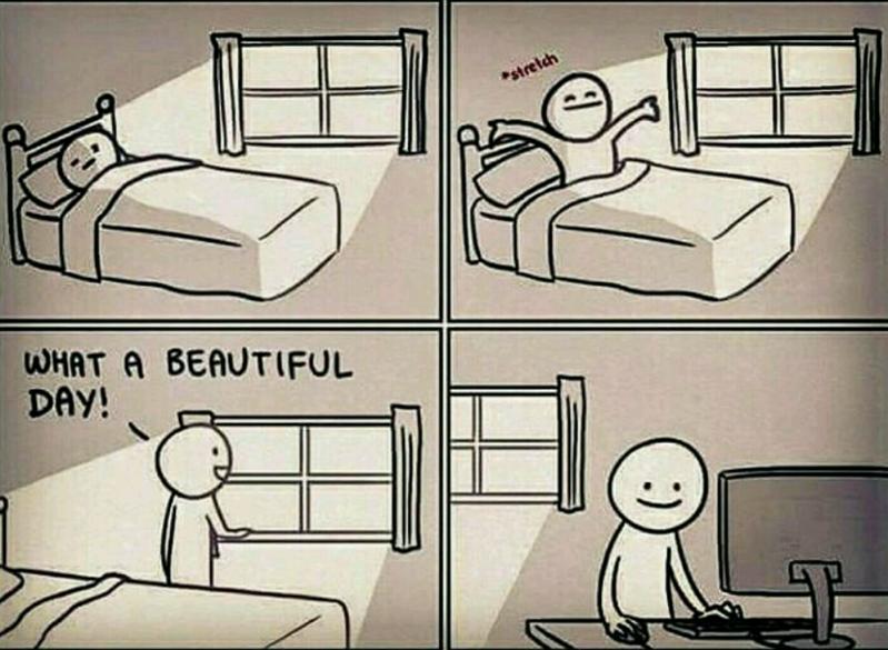 Is it just me or are you like this too? 😆 #devLife
It’s true 😂😂
joke/meme
fonts
front end