Ranter
Join devRant
Do all the things like
++ or -- rants, post your own rants, comment on others' rants and build your customized dev avatar
Sign Up
Pipeless API

From the creators of devRant, Pipeless lets you power real-time personalized recommendations and activity feeds using a simple API
Learn More
Comments
-
the logo should be transparent and the background white and the menue font and icon green. Or the logo should be made white so that it fits on the green background.
-
Looks good. Only thing I would change would be that green line under the logo. That and maybe the transparency a little.
-
Love the loading image design, but hate the loading. Make stuff smaller/quicker if you can. In "Medical treatments" there's probably a broken tag or something (">" character). One (or two?) photo has background cut out too obviously (blur edges or do a better cut). Those are only small issues, quickly fixed. The testemonials, however, have some photos with crippled ratio, this needs real fixing or it will look unprofessional. When viewed as iPad (via chrome), the testemonials are too small and unreadable. Better than images make that pure text and put an image (with corrected ratios ofc) there. If there's no supported font, well... find any casually supported one. Love the color scheme btw!
Related Rants

 The honest website ever... 🙌🏻🙌🏻🙌🏻
 Reality
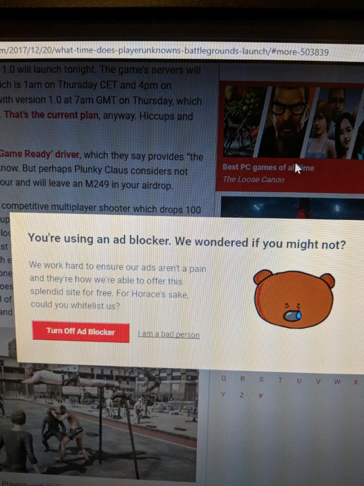
 This is by far the best please turn off your Adblock I have ever seen. I actually paused my ad blocker 😂
our recent work. www.ayumanthra.com
undefined
website
web designing