Ranter
Join devRant
Do all the things like
++ or -- rants, post your own rants, comment on others' rants and build your customized dev avatar
Sign Up
Pipeless API

From the creators of devRant, Pipeless lets you power real-time personalized recommendations and activity feeds using a simple API
Learn More
Comments
-
 Sarcaxxo2807yThis is what it feels like to switch from Inbox back to Gmail...
No "view issue" button for GitHub emails ;_; -
"Sign in with Facebook or google to start your car"
*walks towards the nearest bus stop*
Related Rants
-
 bjorngi24
 The aCalendar app let's you choose vibration pattern, it's one of the better settings I've seen.
 -
 aswinmohanme17
 When you take User Experience to the next level. Just what I was thinking
Credits : Riot App
 -
 htlr79
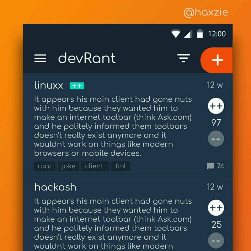
 Been looking around ways to improve devrant's user experience a little, Idk whether you guys like it or not.. ...

I go to unlock my car, but the button I usually use is gone. Instead now it unlocks by long-pressing the car handle.
Ok, got it.
Then my ignition isn't there? Oh, it's in the middle of the steering wheel now? Ok.. but it doesn't work? Oh I have to sign in with Google or Facebook, alright...
Wait, where's my odometer? Oh this is "card" view, and I guess I want "compact" view, huh. Is there a dark theme? Guess not.
Why can't I shift? Oh the stick is a hamburger button now, weird. Um, and reverse is in a sub-menu? That's going to get annoying.
Alright just need to look in the mirror to see if.. wtf? You call this "responsive" or something? I can't see out that tiny window.
I'm very disappointed in all this, I wonder if I can roll back. Oh WHERE ARE THE BRAKES OH GOD
UX DESIGNERS
HAVE
FUCKING
KILLED ME
WHY DID WE TRUST THEM AND THEIR GODFORSAKEN UPDATES
rant
glad app devs don't make cars
forced updates
ux