Ranter
Join devRant
Do all the things like
++ or -- rants, post your own rants, comment on others' rants and build your customized dev avatar
Sign Up
Pipeless API

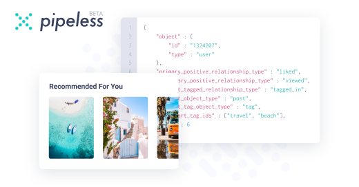
From the creators of devRant, Pipeless lets you power real-time personalized recommendations and activity feeds using a simple API
Learn More
Comments
-
 C0D4644185y5, but I'd shrink the big bird a bit off the edges or show the tips of the wings on the outside.
 -
 Marl3x24815yI think those birds are a bit too small in 5, the rest are too unsymmetrical. I like 4 the best tbh. It's simple and easily recognizable.
 -
It reminds me of boobs (when laying on back).
I think it's a smart move to use "birds" as a cover if you want to have boobs as your company/product logo. -
@Marl3x True, but as my sister pointed out: Mazda...
Also, fixing the symmetry is hard, but it definitely looks bad... -
@rutee07 I'm gonna have to figure out how to un-butt-ify this before I make it official...
-
 dder22295yI like the big small in 5,
Like the rounded square and tips of wings from 3.
I’d try 5 with tips of wings, small birds a subtle tiny bit bigger and the border bolder (as bold as the tiny birds then will be)
They I’d try the square with round corners.
Also, I like the un-symmetry of the small birds. Maybe that could be some more. Maybe some golden radio.
Finally, I think showing the wings of the big bird will un-butt-ify the icon.
What’s the use anyway ? General company logo? Or Icons to click on? App-logo ? -
1-3 look like someone typed the 🐦emoji in Comic Sans.
4 is nice and simple, but some people will see boobs instead of bird.
I would iterate on 5. Maybe make all the lines a bit more bold, and scale the small birds to a geometric ratio of the bigger bird. Eyes & brains love "correct geometry".
Also: I would not include the circle outline, just the shape(s) of the birds.
I would also make the background transparent (png or preferably, svg), so the logo is easy to use on various backgrounds -- with both a light and dark version.
Also look up brand guidelines from companies with a good visual language, like Twitter:
https://about.twitter.com/en_us/...
They think about things like:
"from which shapes is the logo constructed"
"If the logo must be placed in a square or circle, how is the margin defined"
"what should the logo look like when printed in grayscale"
Related Rants


 When you're not creative enough to make a post that would give you some stickers but you have a 3D printer...
 The week before project deadline...
A continuation to https://devrant.com/rants/2629107/...
Again the idea is bird/flock of birds.
Thanks to all the people who gave their opinion last time around.
question
logo
project