
Ranter

Join devRant
Do all the things like
++ or -- rants, post your own rants, comment on others' rants and build your customized dev avatar
Sign Up
Pipeless API

From the creators of devRant, Pipeless lets you power real-time personalized recommendations and activity feeds using a simple API
Learn More
Comments
-
(Mobile)
The "slice of the past" section doesn't fit with the theme. And maybe add a sentace or 2 under the "heres how" part describing each heading( "we make websites" for example) -
 Hitman6569yMobile here too.
Design looks nice! First comment is to say more off what you are offering, make sure the visitor thinks: I should hire you guys!
Second comment is to make professional photo's of yourselves and use those instead!
Good luck! -
 oldfrizt769yMobile:
Looks great, but I wouldn't use the changing color as default. That's a little bit distracting. And after you have written something in a text box and close the keyboard, the site scrolls up so you can't see what you have written. As already the 'What we have done in the past' section looks great, but I think it doesn't really fit in there. -
Random Color was a bit irritating. Also check what kind of files you serve. Took forever to load on mobile without wifi. Maybe lazyloading or svg graphics?
-
@oldfrizt also its off a bit. And the ship at the bottom took ages to load on my phone
-
 Etrunon5439yThe "clock" of past works, while being amazing concept (even though maybe it is not well in the rest of the website), is lagging a lot on nexus 6. I am on WiFi so it shouldn't be a network problem as it keeps on lagging anytime the project changes
Overall good work, o tried light green as color -
 jamlam15049y(PC)
When you hover the mouse over the bottom of the colour picker, it has a small seizure! -
@oldfrizt thanks for the feedback :D will maybe set the default color to a static one then and about the input issue, I haven't seen that before 🤔 will have to check that
some poeple are giving me the "doesn't fit" remark as well, we might see about that though 😀 -
@Data-Bound will probably change to default a static color 😬 and hmm it might be the location your at because it's running of a VPS (single one no load balance) because my load times (and others') are really good but I live in Europe (and my server is in Germany)
-
@pxgamer will definitely see to add more info about it, we have heard that before as well 😬 thanks for the feedback 😀
-
@Etrunon hmm that's weird 🤔 it doesn't lag on my phone and I have a Lumia 830 (so it really ain't that powerful -> mid flag from over a year ago), but I'll see if I can look into it 😀 thanks for taking the time 😬
-
@jamlam problem has been noted and will deploy a fix soon 😬 thanks for taking the time to check the site 😀
-
@pxgamer that is kind of odd 🤔 I can understand some performance issues on some phones because of the javascript and scrolling aspect but on PC it should be buttery smooth (as far as my testing goes even on lower end PC's), anyways thanks for checking it out and giving us some feedback 😀
-
Can't load without js, automatic no. It's an introduction webpage; the fancy animations and nooks support makes it totally unusable in my book.
Sorry if it's a bit harsh; I really hate websites that are excessive with their animation. The site would be much better if the js req and animations are removed, imho. -
@liammartens it seems as if the scroll offset for the colorswitch is not precisely. See attached Pic for example.


Related Rants


 It changed my life, really. 😁
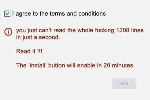 The honest website ever... 🙌🏻🙌🏻🙌🏻
!rant && feedback
So we (me and friends) have been working on this website for a month now and we think we are ready to launch. If you want please do check it out and give some feedback :D would love that
https://freighter.studio/
undefined
freighter
feedback
no rant
website
work