Ranter
Join devRant
Do all the things like
++ or -- rants, post your own rants, comment on others' rants and build your customized dev avatar
Sign Up
Pipeless API

From the creators of devRant, Pipeless lets you power real-time personalized recommendations and activity feeds using a simple API
Learn More
Comments
-
Also, it's a slow and bloated molasses that achieves "clean look" through lack of content, a very cheap trick.
-
Wow - it doesn't even load.
Allowing scripts seems to not be enough.
Maybe it strictly requires web workers or webgl - which aren't just granted to any page wanting them. It is an honour and privilegue to be trusted to use such easily exploitable tech... -
@Oktokolo At a glance, I don't see anything that would even require the presence of JS if the devs had known about HTML and CSS. It looks like a brochure site, after all. That could probably be fully static and blindingly fast.
-
@iiii keep in mind this is coming from the perspective of having seen too many bbs style japanese websites.
also im not the best judge of craftmanship if you havent noticed. -
Wow, this is a site that is not written with arcane technology from 1998 geocities.
-
@Wisecrack That's the point: "nice design" is easy if you don't have content that gets in the way.
Related Rants

 My friend said an intern designed this UI for an internal site.
No. Just... no
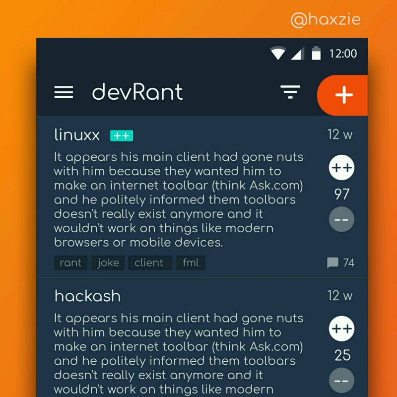
 Been looking around ways to improve devrant's user experience a little, Idk whether you guys like it or not.. ...
Holy smokes, a japanese site that looks cleanly designed, instead of like a wall of text written in moon runes. I feel faint.
https://hyperia.co.jp/
random
design