
Ranter

Join devRant
Do all the things like
++ or -- rants, post your own rants, comment on others' rants and build your customized dev avatar
Sign Up
Pipeless API

From the creators of devRant, Pipeless lets you power real-time personalized recommendations and activity feeds using a simple API
Learn More
Comments
-
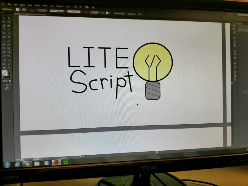
@liammartens We have to create a logo for a use of our choice, such as a business or a community. I decided to go with the business or website category and made this, I could've done better but I didn't want to waste time deciding every tiny detail.
-
@Nifty okay here's my (professional) opinion
1. Too much drop shadow. When using shadows you really have to think about why you are using them and 99% of the times there's no reason to. If you do use shadows also be careful with over using it (like here) and use it correctly. It either has to give a sense of depth or a sense of incoming light / direction and neither are implemented here.
2. I am guessing the "script" word is hand drawn or something but it really doesn't look polished. There's a lot of blemishes and bumps and kind of looks like it was drawn by a 3yo (no offense). When doing something like this be sure to create it in vector and clean up your curves to make them smooth or use a good font instead. -
@liammartens It is in vector, the reason it looks like it has bumps is because my teacher said the lines looked too straight, so I attempted giving it the look like the person drawing isn't a robot. Thanks for the criticism, I'll have to wait till Tuesday to follow your advice but I'll see if I can make it better.
-
@Nifty ping me with an updated version next week and I'll have another look , good luck 🤘🏼
Also another tip for getting the handdrawn type, draw it on paper first and then vectorise it from a scan otherwise it will never really look like it was drawn by a human. Paper drawing is easier to get right because its direct and natural. -
I agree that it looks really cool hand drawn, but I think it IS a bit bumpy in some places; for example, the tail of the P
-
 wbhob2899yYeah it looks like something out of 2008 imho, consider applying modern/geometric design principals. I personally prefer simple shapes and block letters for a clean look
 -
@spaceJunk Yeah, I'm kind of waiting for school to be over so I can take the programming class my school has to offer.
-
 Kalvin12289yEven if others have pointed it out I'll give my professional oppinion too:
The drop shadow is out of place and doesn't add anything.
The "Script" is poorly written. I've read that your teacher told you to fix it, but from a user perspective, if you want to communicate with your logo that your script is "lite" and "easy to write" then the design should tell you that. In that case your "Script" word should be properly hand written since with your script you can write cool things effortlessly.
Also, your lightbulb wire is not centered as the / is a few pixels on the left. This might seem excessive but noticing these things now will help you in the future with taking into account spacing and positioning of elements.
Regarding the cap, since the border is also rounded on the top and the shadow is overlaying it seems that are two separate elements. You can easily fix this if you're using illustrator by taking the point arrow and moving them to be wider on top and creating a curve. -
Despite the valid criticisms regarding some details of the execution, you have the mind of a designer. The tag brackets in the bulb wire are awesome. In a much more stylized form, this could be an excellent logo.
-
@liammartens yup, and I agree with the feedback. Just wanted to point out that the idea behind the logo is pretty neat.
-
@liammartens I concur. Too much drop shadow. If you really want shadows you could maybe make the bulb itself be a light source which makes the rest of the text cast shadows? 🤔 I think that would be a cool direction to go in if you can pull it off right. Better than just putting shadows everywhere anyway.


Related Rants

 Real life automation scripts be like. 😂

This was my graphic design assignment, what do you guys think?
undefined
script
graphic design
highschool