
Ranter

Join devRant
Do all the things like
++ or -- rants, post your own rants, comment on others' rants and build your customized dev avatar
Sign Up
Pipeless API

From the creators of devRant, Pipeless lets you power real-time personalized recommendations and activity feeds using a simple API
Learn More
Comments
-
 nate14927yIn my experience dealing with designers, it is best not to persuade or reason with them. Distract them with something else with limited room for damage (fonts/icons).
 -
This is why AI will never work. Drive a car? Whatever. Try creating a design that two people agree on. Then I'll be impressed.
-
nate14927y@Jilano Oh no, I can see that backfiring pretty quickly.
"Amazing! This bright neon green works great as a desktop too... let's make it the corporate company wallpaper! You can do that right?" -
@platypus There is a lot of variance in tastes, but some principles are scientific.
Color theory is one of them. You can LIKE certain colors more or less, but there are still scientific hard rules about contrasts and legibility, and on average the rods and cones in our eyes have very specific responses to certain frequencies as well.
One important principe is that design elements of equal importance can differ in (equidistant in degrees) hue, but should not differ in chroma/luminance. Accented elements and backdrops should use the same hues at a different luminance level... And the difference in luminance should be constant for all hues.
Whether you do this with pastel pink and a pearly baby blue, or with pair a persian indigo with a maroon is up to taste, but some basic rules do apply. -
 ricvail227y@bittersweet This is interesting. Do you have any recommended readings on the subject? Or google search terms, more generally.
I'd love to know more, but anything that has to do with art is completely alien to me, I don't even know where to begin (I guess "color theory" could be a good starting point)
I like the way you talk about it from a scientific perspective :) -
The Art of Color - Johannes Iten
best book about color theory.
But it costs used more than $350 😭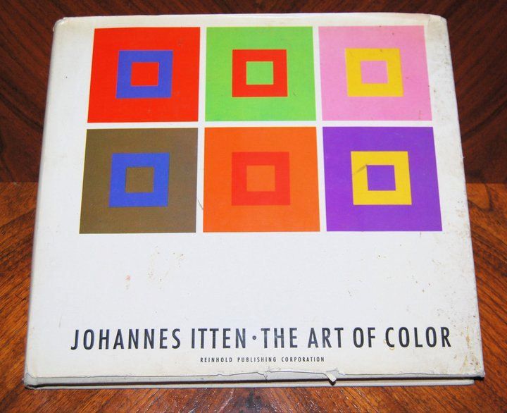
-
If you have to use it in your browser, write a userscript that changes the color for the bright green class to something better. Doesn't affect you, that's all I'd care about.
If it's just from seeing it and just knowing it's there, someone higher than him will hopefully see it as a snot-smeared piece of shit and lose it anyway. -
@ricvail I don't really have recommended reading other than some internet pages:
https://en.m.wikipedia.org/wiki/...
This article made a lot of data scientists aware of picking better colors:
https://vis4.net/blog/2011/...
I worked on developing paper with an ideal whitepoint and developing good printer inks for (among others) national geographic.
That mostly involved a lot of pigment chemistry, testing polymer coatings and optical whiteners, and calculating color differences/tolerances as perceived by the (average, not color blind) human eye.
https://ipfs.io/ipfs/... -
Can you help me with some color stuff? I need little help or you can say guidance.


Related Rants


Our current designer is convinced that 00FF44 bright green fits well with the rest of our soft purple/blue color scheme.
I am not a designer, but have worked in a color laboratory, so I've tried time and time again to explain CIE LAB color space, and how at least HCL is a good way to pick & group colors into palettes by using 2-3 luminances for equidistant hues while keeping chroma constant.
I've tried to tell him that the bright green almost physically makes my eyes bleed, because humans are quite sensitive to greens.
He just keeps using the phrase "but it makes the buttons pop nicely".
I just want to pop his skull open with my keyboard. 😫
rant
wk113