
Ranter

Join devRant
Do all the things like
++ or -- rants, post your own rants, comment on others' rants and build your customized dev avatar
Sign Up
Pipeless API

From the creators of devRant, Pipeless lets you power real-time personalized recommendations and activity feeds using a simple API
Learn More
Comments
-
I always thought the Firefox logo was really cool. Great name, great logo. Sad that they are dropping it for something fashionable.
-
 Qwby4107yI for one like the new icon. Looks a lot sleeker, kinda KDE-ish with the color shades/transitions.
Gitlab uses similar colors but more plain shades and only straight lines. It's different enough for me. -
That image won't be the Firefox browser icon, it'll by the master logo for the whole Firefox projects
The first row in this image will be the new Firefox browser icon
-
Qwby4107yJust googled it, it's wip/design suggestions anyway. And even with the suggested "master design" it's not Firefox' browser logo, but will show up in marketing material etc.
Here is the corresponding design suggestions for the browser, so don't get worked up over nothing.
-
@Qwby no, not Mozilla's, but Firefox as an overarching project consisting of multiple things
-
Qwby4107y@j4cobgarby found my mistake, this is kind of confusing. The icon is for their umbrella brand "Firefox", and "Firefox Quantum" is one of their products, for which there is the "normal" Firefox logo.
They want to have a different icon for marketing purposes, which is what the first option suggests. The second option looks more like the browser's icon. And everything is still awaiting input from the community and is not final in any way. -
@FrodoSwaggins I agree, I really like the current logo, it's just the right amount of flat
-
 Kaji20717yMozilla should stick to what they do well. This and last year’s master brand redesign show that graphic design is not among them.
 -
@Kaji I cannot disagree with you more. I for one like this design direction. Just because you do not like the design, does not mean it is bad design.
-
 enzop12307yThis will probably not be the new logo, ans this is not the logo they will use in the browser
More info https://blog.mozilla.org/opendesign... -
Kaji20717y@aquacash5 Fair enough, but part of good branding is keeping the soul of what people associate with the brand unless there is some reason you *need* to throw out the old. System 1 in particular dumps all of it for sake of looking modern (and rather derivative to boot, as has been pointed out above).
That said it’s pretty bad UX design when nobody can tell what the various control icons in the set are without assistance. -
Well... Don't confuse everything.
There is a masterbrand Firefox logo (shown at events) and Firefox products logo.


Related Rants


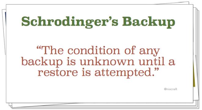 schrodinger's backup
 When you're browsing web with firefox and accidentally opens new window instead of new tab
New Firefox logo vs. GitLab logo
random
firefox
gitlab