Ranter
Join devRant
Do all the things like
++ or -- rants, post your own rants, comment on others' rants and build your customized dev avatar
Sign Up
Pipeless API

From the creators of devRant, Pipeless lets you power real-time personalized recommendations and activity feeds using a simple API
Learn More
Comments
-
 webdev21759ygates is presenting the cloud platform i think and jobs is presenting the hardware, this exact pic is not a fair comparison ... but i get your point
 -
 mhall2739y@thmnmlst I also prefer MS's recent design efforts. They're still dragging a lot of legacy crap around, but their Surface line of hardware, W10 and wphone have some great design to them.
 -
 xroad23149y@thmnmlst design is not just about how something looks. It about how it works and feels. 3 (or more) completely different views for settings is shitty design
 -
 xroad23149y@mhall yup, in my humble opinion that's why the unified windows UI fucked up so bad. On paper it was a great idea but if you want to do something revolutionary you can't look back
 -
 mhall2739y@xroad It's an iterative process though. W8 started it and W10 continues it. More of the UI migrates over in time. In an ideal world, sure, the entire system would be updated in one go ... But the thing is a behemoth... and MS relies on supporting business legacy code too much to make a clean cut (unfortunately).
That and there are a billion users so any major changes will be met with gnashing of teeth and foot stomping by many. -
 xroad23149y@mhall and yes - users are idiots. One small change and they'll throw a fit. Even if it's better for the long term
 -
I personally hate MS's take on flat design. It's boring and ugly. Well I really mean metro. The flatness of W10 is a bit better, but I still feel like they took the whole flat idea and took it too far.
Related Rants

 My friend said an intern designed this UI for an internal site.
No. Just... no
 Why not! 😂
 Made my day 😂😂
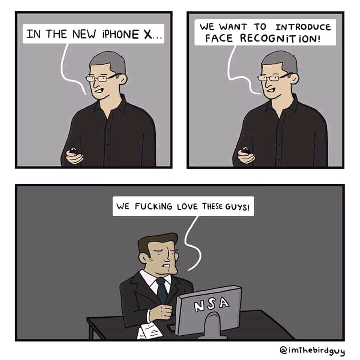
In case you ever wondered why Apple had been hailed as the epitome in design leadership, this should clear it up.
undefined
apple
microsoft
design
nodejs