Ranter
Join devRant
Do all the things like
++ or -- rants, post your own rants, comment on others' rants and build your customized dev avatar
Sign Up
Pipeless API

From the creators of devRant, Pipeless lets you power real-time personalized recommendations and activity feeds using a simple API
Learn More
Comments
-
2. questions
Why are the icons on the bottom left so big?
Why did you choose rose color as highlighting color when everything else is blue, white, grey? -
 flag020179y@heyheni hmm... I was going to go with pink+blue as color scheme, hence the highlight. I'll make the icons smaller.
 -
ok
could you ditch the sidebar? or has it another purpose other than holding these 3 icons? -
 flag020179y@heyheni how about this? I guess the icons are too close to each other. (Changing that).
-
 flag020179y@moagggi maybe due to the longer than usual action bar and use of Segoe UI as font. Totally unintentional to be honest.
 -
 flag020179y@heyheni well, I can move it into action bar but they are specific to chats section and not global. Other option is above the active chats but it doesn't sit well with them.
 -
Looks decent, i am not a fan of the grey sidebar though and would add some more spacing between the icons on it.
Related Rants


 My friend said an intern designed this UI for an internal site.
No. Just... no
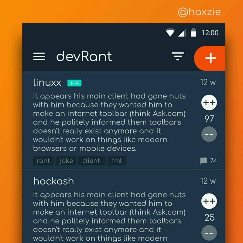
 Been looking around ways to improve devrant's user experience a little, Idk whether you guys like it or not.. ...
!rant
My first design work (in Adobe XD)
Design has never been my strong point (implementation or design) but am very interested in designing interfaces.
Don't hold your horses. Criticize this. I want to know what you think about this.
undefined
design
criticize
review