
Ranter
Join devRant
Do all the things like
++ or -- rants, post your own rants, comment on others' rants and build your customized dev avatar
Sign Up
Pipeless API

From the creators of devRant, Pipeless lets you power real-time personalized recommendations and activity feeds using a simple API
Learn More
Comments
-
 dfox421349y@ryanmhoffman haha yeah, thought it was good one to show since it’s a really long thread :)
@Fionn153 lol, now we just need 10 comments to also have scroll to bottom on this! -
dfox421349y@aj20010319 @trogus does all the design work but in general I think we usually try to design things that make sense as opposed to following any specific guideline strictly.
If you have anything specific in the app that you think would benefit from being more strict material-design-like feel free to suggest it in our GitHub issue tracker! -
great idea! @dfox
But instead of having the seperate comment input mask, what if you could just tap on the comment button and it scrolls down to the end? So you could instantly compose yor comment inline of the rant?
That way you could read the comments while writing and use the mentions function which leads to more interactivity.
Because in the end the scroll down button is only a helper for the urge to write a comment, let's combine it. -
 Dacexi119149yWhat if you added a scroll to bottom button with the social and comment buttons. It's a bit of a struggle to stretch my hands so that I can reach the 3 dot menu :)
 -
 donuts232409yCould you add the button to the bottom tool bar.. pressing to open a menu n then coding feels like to much work for "scroll to bottom"
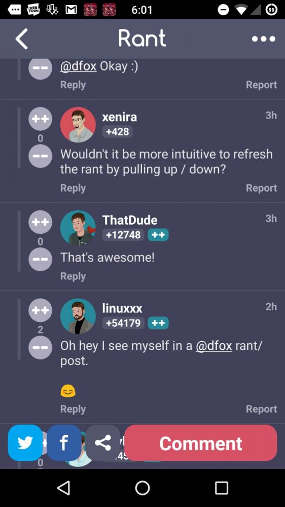
-
dfox421349y@xenira we might add that in the future too, but tapping on the title bar also doubles as a “scroll to top” which we wanted to add too.
@heyheni that will probably happen one day, but is a lot more of a redesign so wanted to get something useable before that happens.
@Dacexi @billgates definitely a possibility, though I’m not sure if we want to add anything else down there, but I think it could potentially work. -
donuts232409y@dfox actually I just realized the share button opens the same menu as other top so technically those Twitter/FB icons are redundant
-
donuts232409yNvm... Menus r different... btw what are the stats for those 2 buttons, sharing to Twitter and Facebook?
For me I've never used them, usually I just want the link to send in a message
Also I don't think save image should be in Share. That's prolly what got me confused in the first place -
 trogus130599yWe're going to change it to top refresh icon that also scrolls to bottom of screen, so if you are coming back to the rant there will be a one tap jump to latest comments at bottom, and soon the Appcelerator SDK is getting an update to make it easier for pull to refresh (my original ambition was to have a pull up to refresh from the bottom last comment, but technical difficulties led to compromises)


Related Rants

Announcing a few new devRant Android/iOS features, available immediately in the latest versions of the devRant app which just went live.
1. As pictured, you can now easily scroll to the bottom of any long rant by selecting “scroll to bottom” in the ... menu of any rant with >= 10 comments.
2. At the bottom of any rant that has at least 1 comment, you’ll now see a button that allows you to refresh the rant (and scrolls to the bottom) so you can see new comments if there are any.
3. Any rant can be refreshed by tapping the “Rant” title in the title bar.
How did we come up with these awesome ideas/decide to add these features? For most of them, we didn’t! At least 2 of these were recently requested by devRant users (some requested a bunch of times) and we heard everyone and saw how much these were needed. Remember, you can always suggested features in our GitHub issue tracker: https://github.com/devRant/devRant - we always appreciate feature suggestions and ideas for improvements!
Just to add one note - we still have plans to improve commenting functionality, but we’re hoping for the time being these additions make things a little more intuitive.
Let me know if you have any questions, and thanks everyone!
devrant
commenting
feature
comments