
Ranter
Join devRant
Do all the things like
++ or -- rants, post your own rants, comment on others' rants and build your customized dev avatar
Sign Up
Pipeless API

From the creators of devRant, Pipeless lets you power real-time personalized recommendations and activity feeds using a simple API
Learn More
Comments
-
 mirazmac4376y@kescherRant I'm aware of that but any particular reason to do so? What's their philosophy behind this choice?
 -
 C0D4645146y@-red hahaha, given we are talking about MS and "windows phone" I don't count as anything worth mentioning, the assumption is monitor not phones.
I'm not a fan of the notch, but I kind of ignore it most of the time.
Sadly the competition took up the notch, so there's no real escaping it. -
 p100sch13696yDo you remember windows Vista. It had round edges and was still terrible. I prefer the pointy ones as they let me actually fill the screen even when windowed.
 -
I remember designing a website two years ago. It had lots of round corners. Looked Like shit since I'm terrible at coming up with my own Designs. My boss said he was glad I'm Not a designer and that round corners are the devils Work. They're Not "hip".
Some Design philosophies don't make any fucking sense. -
 nnee4576yMostly rectangular design has an impression of seriousness, professionalism, reliability...
MS primary target audience are business users. Home user pirate their sw more often than not.
Lookup e.g. bouba-kiki effect. -
Because border-radius on everything looks 2010 or so. It's different with a small rounding (2px or so) on CTAs to make them stand out a little.
-
Because it looks a lot better than literally anything Google designs.
DevRant without rounded corners is also so much better. -
More serious straight lines make it look more organized. The design of YouTube is one of the main reasons I don't use it anymore.
The reason I don't use my company email is because literally everything is round. Why make everything round? It just does not make sense. -
Rounded corners should be extended to only circle shapes. That would mitigate the issue of vertical videos.
-
@NickyBones Not that this would matter, given that machines from 15 years ago were perfectly able to draw rounded UIs with no performance problems.
Also, if MS cared about performance, they wouldn't have insane 450k of CSS on their homepage where even one tenth of that would already be generous, not to mention the batshit crazy 1 MB of JS, and then distributing the whole crap over 143 requests.
The 170k of markup are also no achievement. Bloated with inline scripts and inline styles that make me wonder what the 450k and 1 M of external styles and scripts are even for. -
@NickyBones The resources in these machines aren't so tight that rounded corners would be an issue in any way. The decision for sharp corners was done for reasons other than performance.
One such reason is when you have four rounded elements together, you get sort of "circles" in the centre, and that draws attention to it - which it shouldn't do because there's literally nothing. -
 theuser46626yImo, use both where it makes sense. Don't ever ever discourage the use of anything because the people actually using your guidelines are perfectly capable of finding use cases for it.
Yes, Microsoft has a lot of rectangles and I really dislike it because there is no balance. Devrant is pretty good in my opinion, but does have some inconsistencies. For example, this textbox I'm currently typing in should not be rounded because no paper ever will have rounded corners, it just looks dumb.
Edit: I take that back, devrant is pretty bad in terms of balancing geometry. -
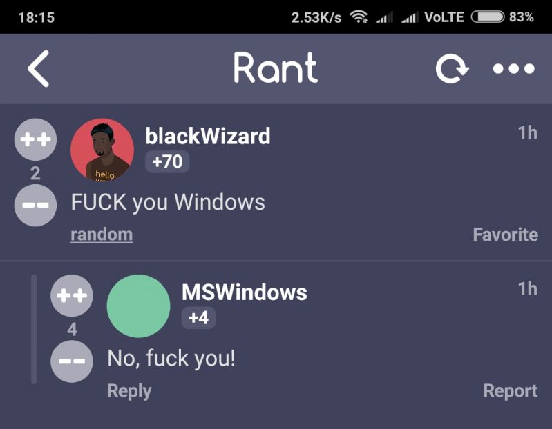
@theuser the buttons on the bottom of a rant page like in the screens hot would in my opinion look way better when not rounded.

-
@NickyBones Well given that the GUI on my 8 MHz 68k Atari ST was blindingly fast, and that GPUs were not even invented at the time, it's hard to see the performance problem. And trigonometric LUTs are still common in embedded.
However, the safety criticality is a major point. Given how much each line of code costs before it is allowed in critical systems, and even more so in combat ones, rounded corners would have added considerable cost for no real value.
Edit: wait, I'm just realising HOW old these systems are, with the first flights back in the 1960s and 1970s. Sure, that was a totally different era. -
theuser46626y@Codex404 My problem with that button bar is the overkill size of the comment button relative to the absolute useless social media buttons. (Oh so I wish people would stop muddying up web pages with social media button)
Imagine if web developers would actually use media queries for more than just querying the viewport width (which makes no sense nowadays) and, say ,render different buttons depending on your input types.


Related Rants

 Made my day 😂😂
 This made me laugh
I never understood why Microsoft hates rounded corners so much?
It's like they swore an oath to never use rounded corners in their apps or websites.
rant
microsoft
rounded corners