
Ranter

Join devRant
Do all the things like
++ or -- rants, post your own rants, comment on others' rants and build your customized dev avatar
Sign Up
Pipeless API

From the creators of devRant, Pipeless lets you power real-time personalized recommendations and activity feeds using a simple API
Learn More
Comments
-
 coookie26029yThis is so clean, straight up my alley. I might not have any use for it but I will keep it just for that design.
 -
@coookie Thanks man, appreciate it.
I have other areas of the app drafted too so will keep them coming as I make progress. -
Wow, just wow. Amazing. Post a link when it's done. And since it's electron, will you support linux?
-
@poster983 You bet, I also want to support Mac too but don't own one to test on so that might not be possible.
-
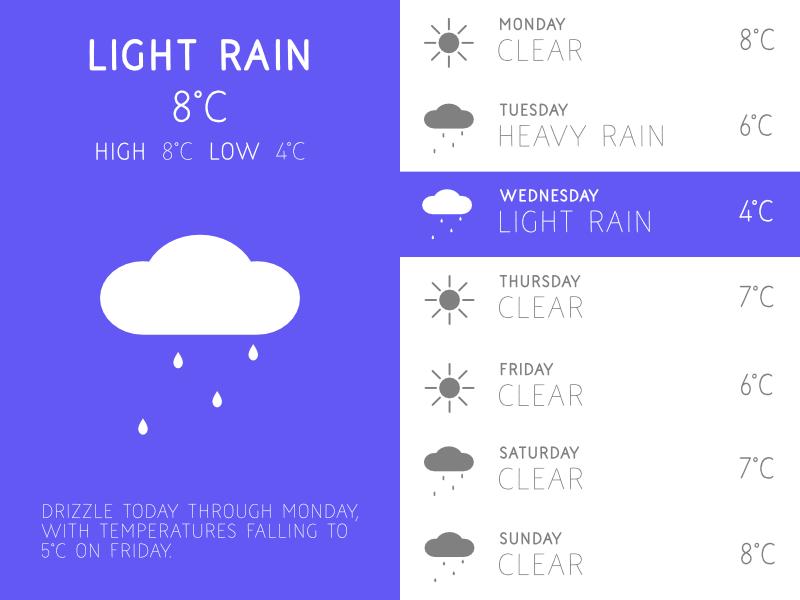
Nice work with the typography/composition! i don't think there is any point in drawing up the weather icons though, unless you intend to do something different or unique with them, your rain icon isn't great. I would use these carefully crafted ones....
https://erikflowers.github.io/weath...
Is there any way to get/view more data? Like the forecast for the rest of the day? Showing the weather for right now is probably not any better than looking out of the window. I'd also reconsider the logo simple single colour (looks like a printer ink icon at the moment). Love to see how it develops, looking great! -
@helloworld Thanks for the feedback.
The icons are unique and purpose built to be simple. When it comes to weather icons if you look closely there is close to zero variety so I think its good to have some that aren't quite so cookie cutter.
Perhaps a closer look would help: https://iconfinder.com/iconsets/...
Point taken about the logo, it's only multi-coloured to demo the colours and isn't in app.
This is only the forecast selection screen, a lot more is coming. -
@nblackburn ...but why re-do them? I cant see why you would put in the effort? Its a massive project in itself, to make a full unique and cohesive set of weather icons would take months to do properly, realistically how different can you make them?
-
@helloworld Because i wanted something different and design agnostic.
If this boils down to 'don't reinvent the wheel' then why is there multiple tyre manufacturers? -
@nblackburn sorry just followed your link, the detail (snow/rain) is too small in relation. As i said its a massive task and i dont think you have cracked it with those.
-
@helloworld it's OK, i can look into improving them.
This project is a couple of days old and is very active so expect a lot to change between now and release. -
 sgoten709yVery good work man. You know what you are doing. Don't quit, just keep going!
Keep us updated it -
@JS96 Sorry, @localhost pointed out some flaws so i removed them while i work on making them better.
-
Thanks for all the support guys and gals, i am working on the forecast screen now.
-
 yo-yo13419yHaha it looks really minimalistic. Nice design. Would love to use the app when it's finished 😀
 -
I have decided to open up my Trello for everyone so they can keep track of what is going on.
https://trello.com/b/dgoRl20B/... -
@JS96 I personally love material, however I think this design is great without material. It's very unique.
-
@poster983 I have nothing against it either, i just think it has it's place and shouldn't just be haphazardly applied to everything.
-
I am considering calling the app Dew (as in Dewdrop)
It's short, relevant and compliments the simplicity of what I am trying to achieve.
What do you guys and gals think? -
coookie26029y@nblackburn Actually, i am starting to feel Dewdrop has a ring to it, slightly more than dew. Like devRant, dewDrop too sounds like two words merged, sooo maybe that's why I like the sound of it!
Choice is yours mate, sorry if I made this decision difficult for you 😅 -
@coookie It's no bother, I was hoping for some feedback so am glad you chimed in, if you think that sounds better we will go with that because I like both.
-
@sgoten No, logos are always best in a single colour. The previous one was just showing off some of the options.
-
Just to give you guys an update (I aim for one a day), I am reworking and expanding the icon set.
The new set will include many new additions including moon phases (waxing, waning, gibbous etc). -
The next few updates will be focused on iconography.
Today i continued to expand on the icon set adding more new additions such as thermometers and umbrellas. -
 JS96182599y@nblackburn I know that you want to create something minimalist, etc. but will these icons be animated?
I think that some slight animation (for example the rain) could be nice. -
@JS96 I have thought about it but am not sure yet.
Minimalistic to me is not taking stuff away and having fewer, it's knowing how to tell the full story in a simple a way as possible.
Part of this is understanding visual heierachy, colour theory and what makes for a seamless experience to the end users.
The art of minimalism is one of the hardest things to get right but I am going to take my time and try to get it right for you guys. -
Sorry for the lack of updates, i am feeling a little under the weather at the moment and hope to be back to normal soon.
-
@sgoten Sorry, i have been busy but picked it back up last night with some revised icons.
-
The project isn't dead don't worry, i will update everyone once i have something to show.
-
@JS96 I decided not to continue because there is already thousands of them so it would be fairly fruitless to add another.


Related Rants

 My friend said an intern designed this UI for an internal site.
No. Just... no
My friend said an intern designed this UI for an internal site.
No. Just... no
 It changed my life, really. 😁
I got board and decided to make a weather app.
I have designed everything except the font which is Open Sans.
The app will be created on Electron and will be my first entry into that world.
It is currently in the design phase but thought it might be nice to share it's development with you guys.
I hope you like it and as always feedback is more than welcome.
undefined
development
app
weather
design