Ranter
Join devRant
Do all the things like
++ or -- rants, post your own rants, comment on others' rants and build your customized dev avatar
Sign Up
Pipeless API

From the creators of devRant, Pipeless lets you power real-time personalized recommendations and activity feeds using a simple API
Learn More
Comments
-
Glad to see it actually making use of the real estate, the last layout was shite and only using 50% of the screen.
-
I habe this theme activated since it was available. 😀
I had to set a timestamp in a cookie one year ahead using the dev-console. -
@Trablarer if you use the official dark theme, it will never be outdated like some Stylish themes
Nevertheless, I still use Stylish when there's no official dark theme -
 qlasico10468yTo me it's a little weird...err... It looks like... ejem... other sites I use... Soo I'll stick with the white one for now
 -
@qlasico plus now if you hover over the thumbnail, it shows you a preview, all too familiar
-
My one gripe is that it now takes two clicks to get to my subscriptions, it used to be one.
-
Really looks like another site i know.... But i cant remember....
...
Ho...hahaha.... Nevermind -
@Santaclauze i could have gone hohoho as well but i wont want to ruin christmas -_-
-
 Valeth1738yIt's nice, until you open the subscription management or the edit playlist page.
Unless they fixed that recently, can't check because I'm on mobile. -
exerceo12122y@Stuxnet Smartphone and app makes switched from black to white, realized it was a bad idea, switched back.
E.g. Galaxy Note 4 white menu backgrounds.
Related Rants


 Sometimes the answer is just ... savage.
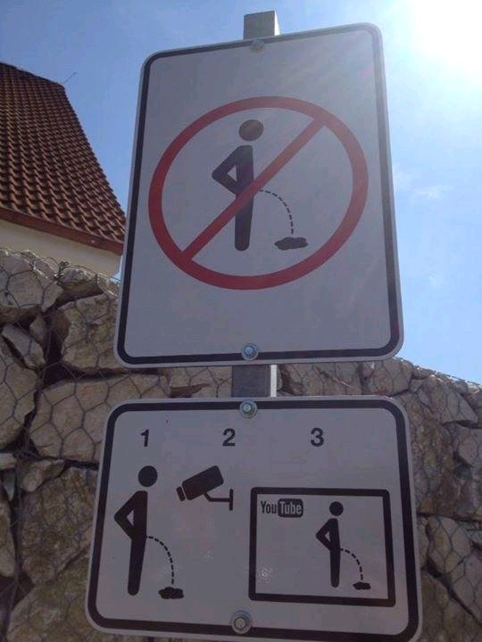
 This is how they prevent people from urinating in public in the Czech Republic.
So YouTube is busy soft launching it's new look and guess what?... It has a dark theme!
undefined
join the darkside
youtube
its about time